This is the story of a stupid decision. Not a life changing stupid decision — it’s about phones—but still…
In mid-September 2014 when the iPhone 6 came out, I replaced my trusty Nexus 4 with a shiny iPhone 6, and I’ve been regretting switching to an iOS phone ever since.
I’ve had this ‘iOS annoyances’ Evernote since then, logging annoying stuff, and I feel like the aggregate pain caused by iOS has grown enough for me to write this rant now. People kept telling me “you’re just adapting,” “you’ll get used to it”—I haven’t.
First of all, the reasons I switched to the iPhone:
- I spend more and more time on my phone (don’t we all) so I wanted and was happy to pay for the best. My Nexus 4, bought in December 2012 for about 360 Canadian Dollars unlocked had served me well but it was now growing a bit senile—mostly on the battery life front
- iPhone 6 was the best hardware from any phone I could see on the market at the time. That new A8 chip, the screen resolution, the beautiful rounded design, the camera, etc—clearly it’s made of good stuff.
- I’m always interested in new apps and startups often launch iOS-first. Often the Android version takes a while to get out. Being on Android I was tired of having to wait for the latest cool software.
I didn’t do enough diligence on the OS however…
___
Now, here’s why I’m pissed off. I’m going to go through things that suck on iOS that I could do easily on Android.
1. Sharing things easily between apps
This is probably my number one pet peeve.
On Android there’s this concept of Intents, which is a request to do an action in an App. Every app exposes an Intent API to every other app lets every app send it intents.
So on my Nexus I could share stuff from any app to any other app. Pocket to Gmail, Chrome to Whatsapp, Evernote to Asana, you name it.
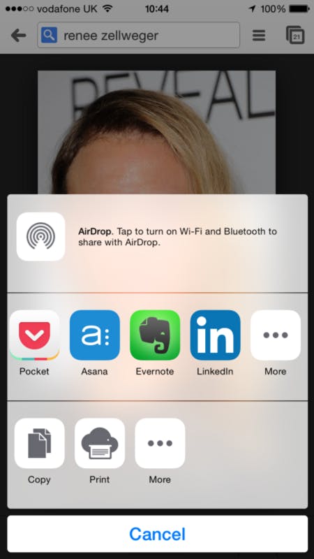
Now on iOS I can only share stuff with the apps that have been properly integrated (that’s the technical term) with iOS.
That means I cannot easily share this picture of Renee Zellweger’s metamorphosis (which I learned about last night) from Chrome to WhatsApp. Or Chrome to Gmail.
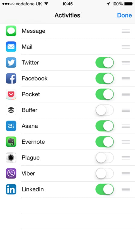
Pocket, Asana, Evernote, etc. is the list of privileged apps which you can share with. Gmail, WhatsApp, Slack, to name a few important apps for me, did not make the cut.
This means that to share this link to any app that’s not integrated, say Whatsapp, I have to:
- Copy the Link
- Leave Chrome/Safari
- Go to WhatsApp
- Find the right conversation
- Paste the link
Yes. Copy/Paste. Ridiculous.
Also, I’m being generous and taking a case where I’m already in the browser.
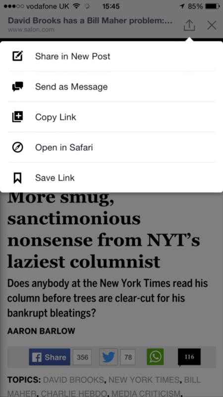
But say I got to this link from Facebook, so when I open it I’m in Facebook’s browser which means to share on another social network I need to first Open in Safari, then go through the charade described above.
2. Having useful widgets and quick settings
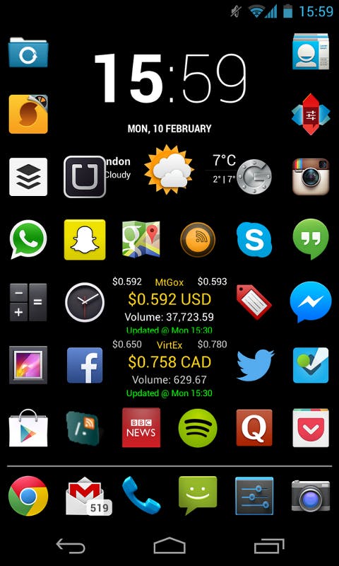
Alright, it looks a bit like a battlefield, but this home screen I had (using Nova Launcher) was super customisable.
I was free to make it look this ugly ☺, to put as many apps as I wanted on there, widgets (bitcoin prices and time, date, and weather) and if I pulled the notifications bar I had access to quick settings to turn on/off Wi-Fi, cellular data, Bluetooth, to dismiss all notifications, change music, brightness, and volume.
Now on iOS I’ve got this joke of a widget solution in the form of the Today screen:
The main problem with this solution is that you need to pull down the notification bar and select “Today” to see the widgets.
It’s the same with the Mac OS dashboard—you need to go there.
To me that defies the purpose of these widgets which should be there next to your regular workflow for you to take a quick glance almost subconsciously.
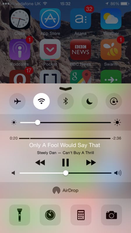
In terms of quick controls, there’s this nice feature on the latest iOS, it’s super helpful & easy to access with a swipe upwards from the bottom of the screen. Lacks a toggle for cellular data though, so to term it off (e.g when roaming abroad) you have to go to settings, cellular data, disable.
3. Better integration between browsers and apps
On Android, say you have Twitter installed and you click on a tweet from your browser (e.g a tweet that has been linked to in an article) it opens it in Twitter.
On iOS it really struggles to figure out that you’re looking at something that should be opened in an app. I’m guessing this ties in to #1, that apps cannot be as closely integrated (with Intents) as on Android.
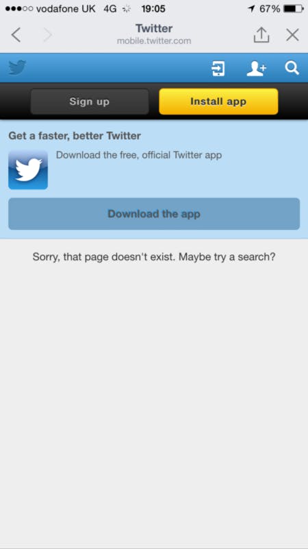
In any case, it leads to this kind of BS:
No I don’t want to sign up. I am already a Twitter user.
No I don’t want to “Install” or “Download” (why the two words?) this app, I have it already on this very device.
Yes this page exists, I opened this same link on Desktop and it worked fine.
Nuts.
I’ve had the same sort of thing happen with Facebook, Quora, Asana, and the FT, where it won’t open in the native app.
And a few more things…
Now for a few more smaller things that piss me off:
- No back button. I understand the decision to only have a home button from a design perspective, and it looks great, but what happens is that different apps have picked different places to put their “back” button in their UIs. Most do it on the top right, but some don’t e.g twitter images where you have to click on the image to dismiss it. Having a common back button for all apps (in hardware) means you dont have to look around to find the back button in various UIs.
- Google Now is better than Siri. Plenty has been written about that. It’s pretty clear.
- App Store search and discovery is a mess. This post makes that case very well.
- No way to dismiss all notifications at once. You dismiss once per app. If you have notifications from six apps, you click dismiss six times.
- Non-threaded notifications. You get one notification per email, one per WhatsApp message, one per mention on Twitter. What is this nonsense? Android groups these (e.g 12 new WhatsApp messages) and you can swipe down on that notification to get the detail.
Conclusion
OK these reasons are getting increasingly pedantic as this post goes on… ☺
In summary, while I can do everything I want to do on my iPhone, it’s slower for me to use than Androids.
Some of these reasons are purely bad UX implementations (e.g notifications & the “Today” screen), some have deeper ties to the design philosophy at Apple to be a more “closed” ecosystem, which is why third party widgets and keyboards are so new to iOS. As a consequence, Apple also lags on integration between its apps, and that’s bad coming from your mobile OS.
Cheers for reading—iOS Fanboys/girls, let’s fight it out on Twitter.
This piece was originally featured on Medium, and reposted with permission. Its author, Ernest Oppetit, is a product manager at Qubit in London, chutney enthusiast. You can follow him on Twitter here.
Photo via nrkbeta/Flickr (CC BY SA 2.0)

