Facebook is no longer a social network. It’s a content delivery system. Or in founder Mark Zuckerberg’s words: “The best personalized newspaper in the world.”
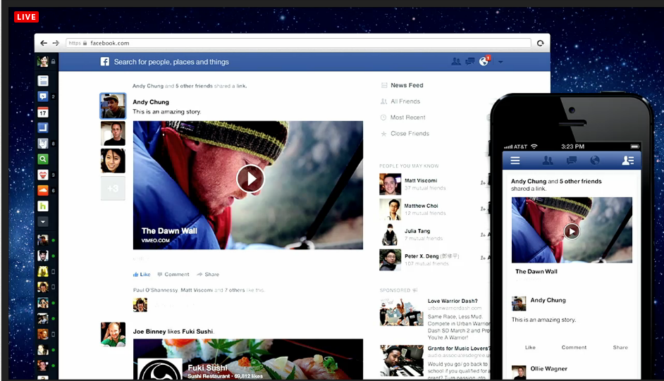
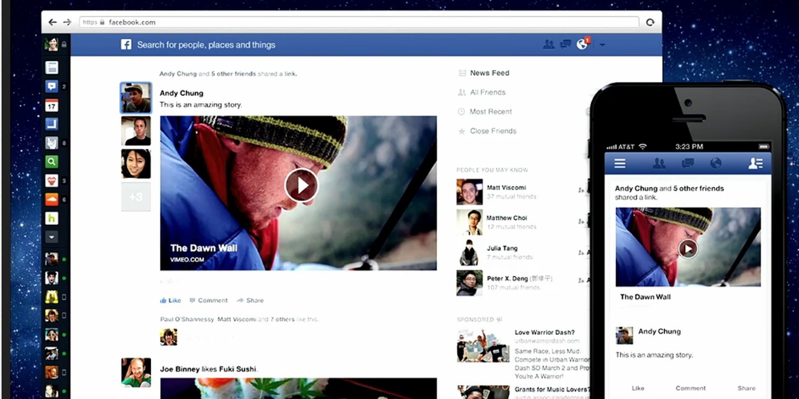
That was the main takeaway from the social giant’s big press event earlier this afternoon, where Zuckerberg and other staff unveiled a new design that will amplify the role of content in your newsfeed—especially photographs, images, and link previews.

Almost 50 percent of the newsfeed is already visual, so the redesign is in a sense just bending to the will of Facebook’s 1 billion users. “We’re taking photos and putting them front and center,” Julie Zhuo, the company’s head of design for the News Feed said.
Meanwhile, previews to publisher sites will “look like the table of contents from a well-curated magazine,” Zhuo said.
The move is a clear effort to make Facebook, which depends on user engagement, more engaging. Gone is the distracting three-column design and that awful news ticker, which the vast majority of users ignore outright. Instead, the News Feed, which contains the only content users actually care about, is blown up to a more fitting proportion of the home page.
One minor but important new feature allows you to sort through various “feeds,” from music, to games, to pages. Customization only benefits Facebook; users don’t like that an inhuman algorithm usually dictates what they see or don’t see from their friends.
The focus on the word “feed” also emphasizes the fact that Facebook is becoming more about aggregated Internet stuff—a glorified RSS feed—than about your friends. One of the filters you can sort through is an “all friends” feed, where every single thing your friends post flows in marvelous, easy-to-follow chronological order.
In other words, the core purpose of Facebook—to connect you to the people who matter in your life—is now just a secondary feature. Say goodbye to the social network, and hello to the newspaper.


