Flickr simultaneously revamped both its desktop experience and its mobile app in a major update set to go live Thursday.
The new Flickr looks extremely promising for longtime users and casual mobile photo-sharers alike. The update is arguably the Yahoo-owned site’s biggest redesign in its 11-year tenure as the Web’s most prominent photo-sharing community.
The old Flickr was starting to show its age, and the team knew it. To upload and sort photos, Flickr users would have to slog through menus, checkboxes, and far more clicks than should be necessary to do the sort of things that take just a few swipes on mobile devices.
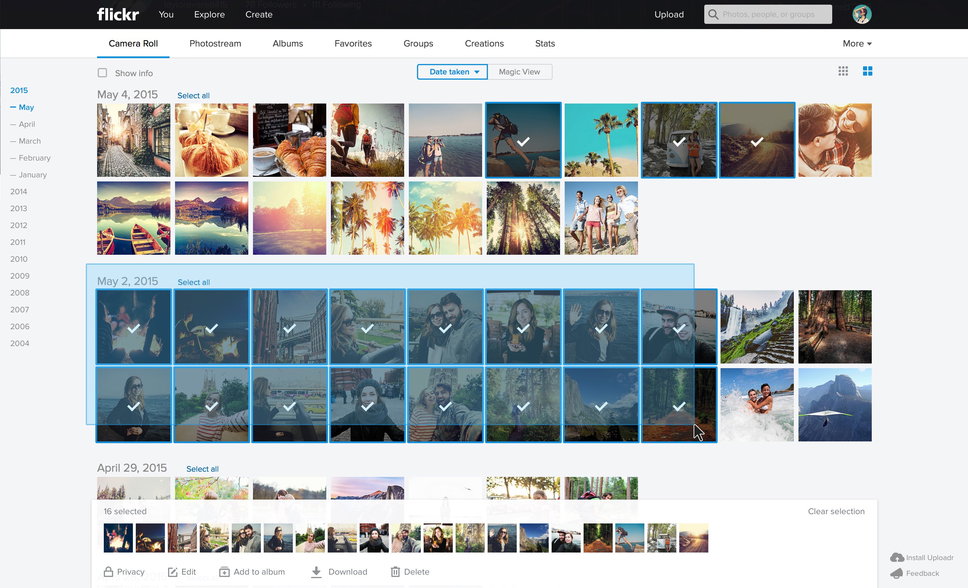
Happily, doing just about anything in the new Flickr looks about ten times faster, thanks to a brand new layout engine rebuilt from the ground up. The new experience looks as fast and smooth as a dedicated desktop app, rather than the old browser-based Flickr to which we’ve grown accustomed.
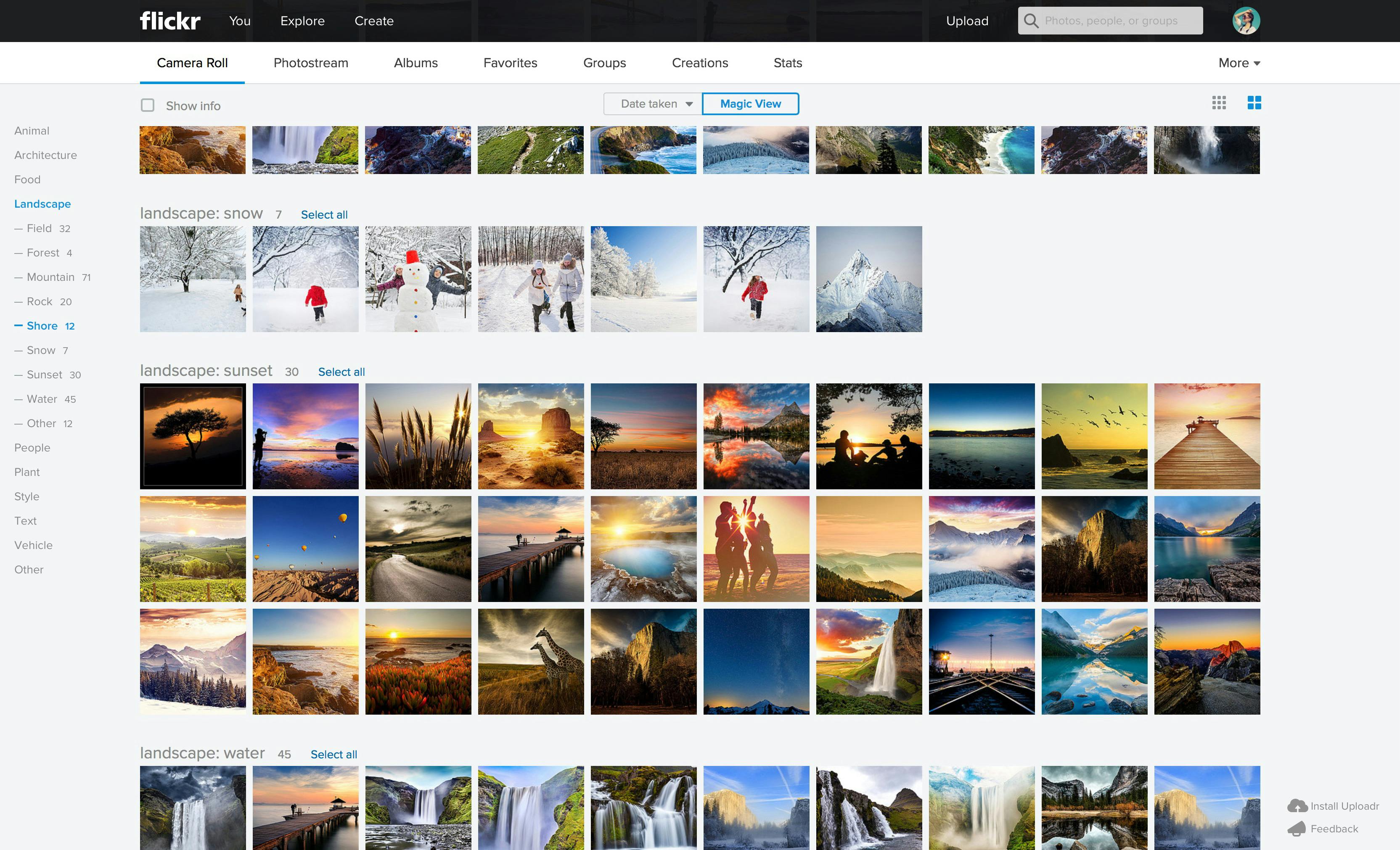
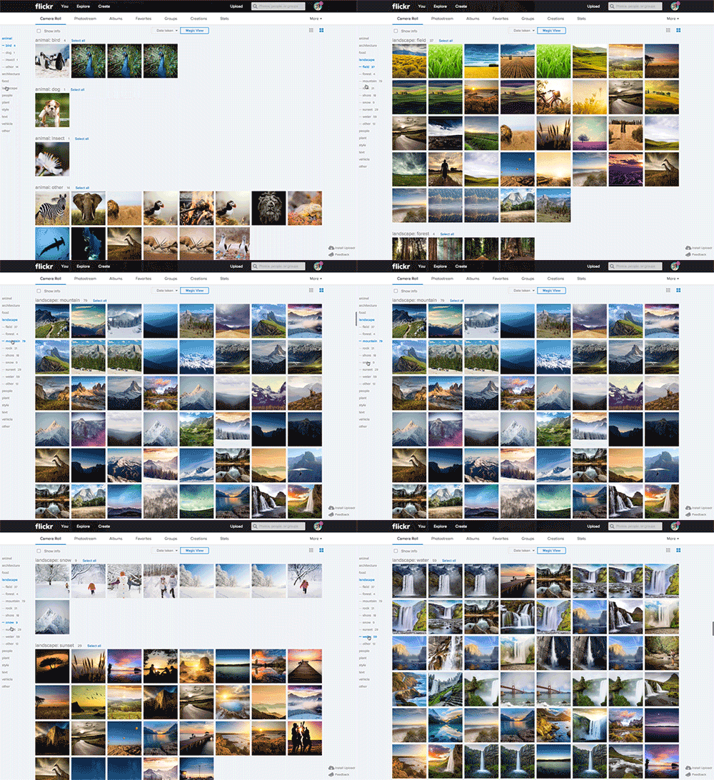
Dragging and clicking makes batch-selecting and organizing photos far easier, while a new wave of algorithms leverages a kind of machine learning known as “computer vision” to automatically sort photos into albums just like a human would.
The new computer-vision–powered albums look like a huge improvement over Flickr’s traditional albums, which required constant pruning and sorting—and a whole lot of time.
“Gone are the days where you had to create albums with your photos,” said Flickr Product Lead Aditya Kashyap. “Really what we’re trying to do is automate it as much as possible so you can get to the fun part, which is sharing.”
Kashyap knows that people let photos pile up, whether they’re sitting in a camera roll or on an SD card. It’s the unspoken curse of digital photography: “They just sit on their hard drives. We want to eliminate the entire pipeline…. [photography] should be about artistic vision and endpoint.”
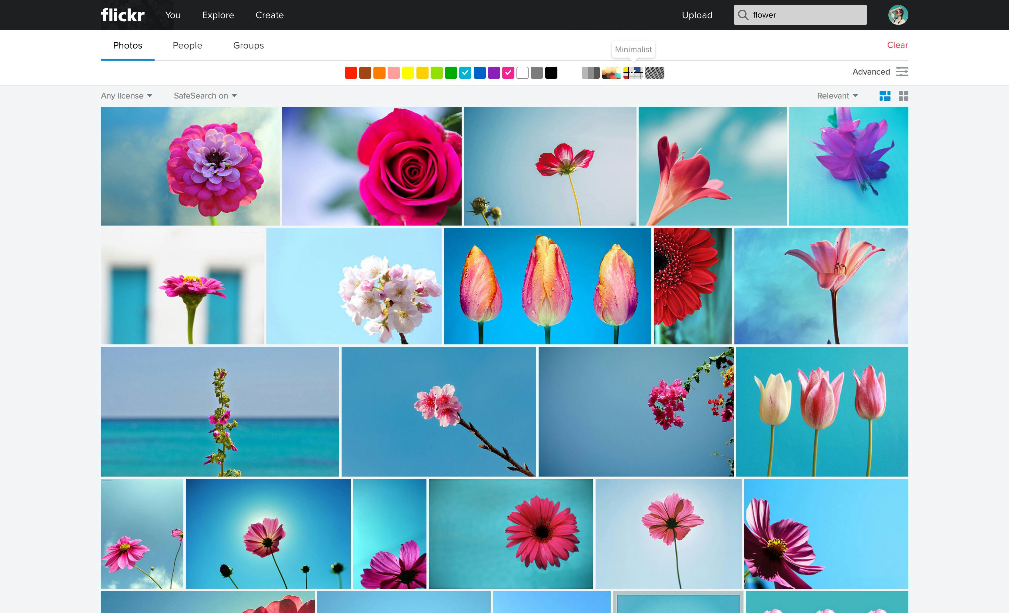
For photographers, Flickr is equal parts portfolio and database. Users can host massive numbers of original-quality images for free, but Flickr isn’t just “cold storage”—it’s a lively yet clunky platform for photographers of all stripes to upload, sort, and share. Sharing is improved in the new Flickr, but the company isn’t trying to overtake other photo-sharing apps at all—it wants to make sharing to them less of a headache.
As Flickr modestly amassed huge troves of photos—quietly maintaining its position in the top 100 most-visited websites in the Unites States, according to Alexa—other mobile-first photo-sharing apps have focused on the presentation aspect (try finding your old images in Instagram; it isn’t fun). Like the improvements to the Flickr browser experience, a mobile redesign will bring the app up to speed as well.
Flickr also wants to get better at the cloud. Citing the massive iOS update that had users frantically deleting their photos to free up storage space late last year, Flickr Associate Product Manager Xanthe Travlos explained that now you don’t have to worry about keeping local copies of photos. Your entire photo roll can be beamed seamlessly to Flickr’s free terabyte in the sky, where each picture is private by default until shared.
Visually, the Flickr app has a sleek new design that’s a far cry from the traditional (and bland) photo-roll experience.
“It’s always wonderfully easy to get lost on Flickr,” Travlos said. “It’s my favorite form of procrastination.”
Screengrab via Flickr


