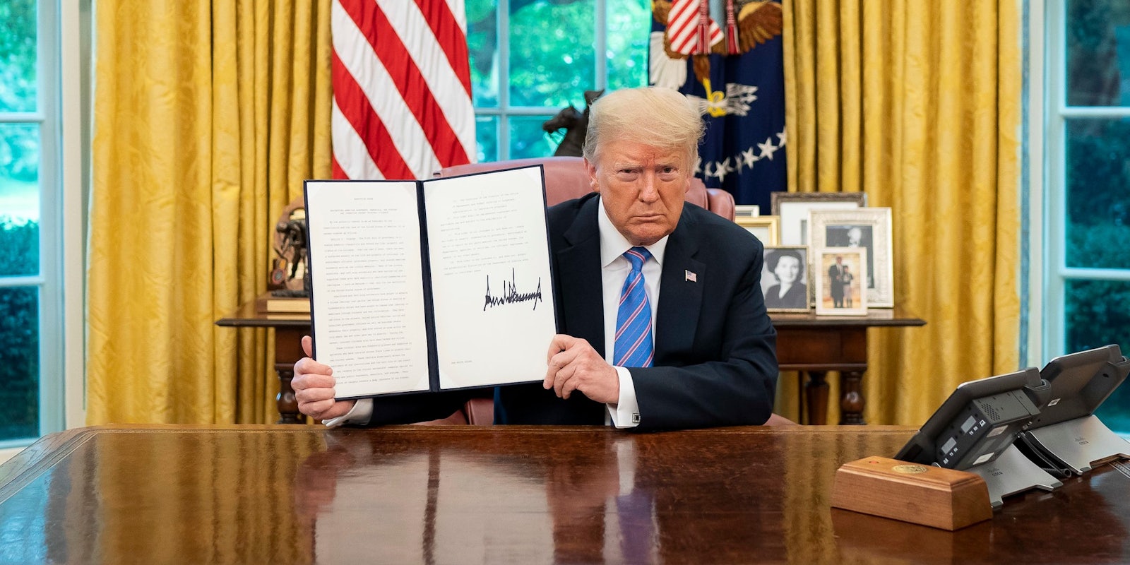
Many Twitter users believe that President Donald Trump‘s signature looks strikingly similar to charts showing the COVID death toll in the U.S.
Noticed by columnist Dan Savage on Monday, the statistics regarding those who have died in the U.S. from COVID-19 appear as abrasive and haphazard as the president’s John Hancock.
“Googled ‘covid death toll’ and this image was the first result and for a split second I thought I was looking at Donald Trump’s signature,” Savage wrote.
Savage also noted that besides their visual similarities, “COVID’s death toll is Trump’s signature” in more ways than one.
Other Twitter users agreed, likewise stating that they too thought the death toll chart was a perfect reflection of the president and his signature.
“His name is all over it one way or another,” @AliciaBrockway said.
Many also suggested that it’s nearly impossible to tell exactly where the death chart begins and the president’s signature ends.
“His signature program was ignoring the problem, so yeah…” @thepaleodrummer added.
As of Tuesday, more than 335,000 people have died in the U.S. due to the coronavirus. The president has been widely-criticized for his administration’s approach, or lack thereof, to the deadly pandemic.
Despite infections and hospitalizations continuing to rise, Trump has all but checked out as his final days in office run down.
The president even admitted to downplaying the severity of the virus in a now-infamous Feb. 7 conversation with journalist Bob Woodward.
Trump also repeatedly claimed to have the pandemic under control and asserted that the virus would “disappear.”


