Taylor Swift picked the worst possible day to take over the Tumblr Radar. Just about the only thing that could have overshadowed the singer’s guest curation of the Radar feature is a disastrous Tumblr update—and unfortunately for the platinum pop queen, that’s just what happened.
Everyone knows that Tumblr’s interface, particularly its dashboard interface, is not the greatest. Its mobile app is notoriously unusable, its discussions are ridiculously hard to follow, and Xkit, the third-party extension that fixes most of Tumblr’s most glaring issues, is so popular that “The XKit Guy” is frequently likened to a god.
Given all of that, it makes sense that Tumblr wanted to make significant changes to its interface. But the changes they made, rolled out with grand fanfare without any advance warning (or apparently much beta-testing), have sent Tumblr into meltdown mode.
There are a number of apparently inexplicable changes in the new layout, which seems to have been designed with an eye toward responsiveness and cross-platform compatability. The dashboard has changed from a dark blue to a slightly different shade of dark blue. Rounded corners are no longer rounded. The inbox notification icon is no longer red, and notifications no longer look as excited about their existence. Posts are no longer centered on the page. There’s no longer as much space between posts. The widened dashboard space means that, for Xkit users, several features no longer display correctly on the page.

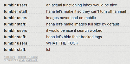
Screengrab via assassinregrets/Tumblr
But the biggest, most facepalm-worthy changes involve the way images display on the page. The size of the image box has been expanded from the standard width of 500 pixels to the unusual 540 pixels. Ordinarily bigger pictures would be good news, except that now, all old images and gifs which were sized to 500 pixels are being automatically stretched an extra 40 pixels.
To a layman’s eye, that might not make much of a difference, but anyone skilled in graphics work or familiar with imaging on the Internet knows that stretching an image from its original size always blurs and reduces the quality of the image. For the millions of artists and graphic-makers on Tumblr, that’s horrible news.
What makes it even worse is that, if you try reuploading an image after cropping it to a width of 540 pixels, Tumblr’s auto-resizer—which is apparently still set to 500 pixels—first shrinks the 540-pixel-wide image down to 500 pixels, then enlarges it back up to 540, so the picture is doubly distorted from the original. To say that this is a mess is putting it mildly.
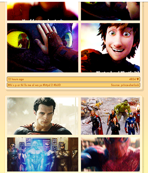
Not only that, but gifsets and photosets which display from left to right on the page are now uneven, with the photos on the left taking up more space than the ones on the right.

Screengrab via roostergums/Tumblr
Lastly, the image changes are inescapable: the option to display images at thumbnail-size has, at least for now, been taken away. Photos automatically appear at full-size. This is bad news for people with slow connection speeds.
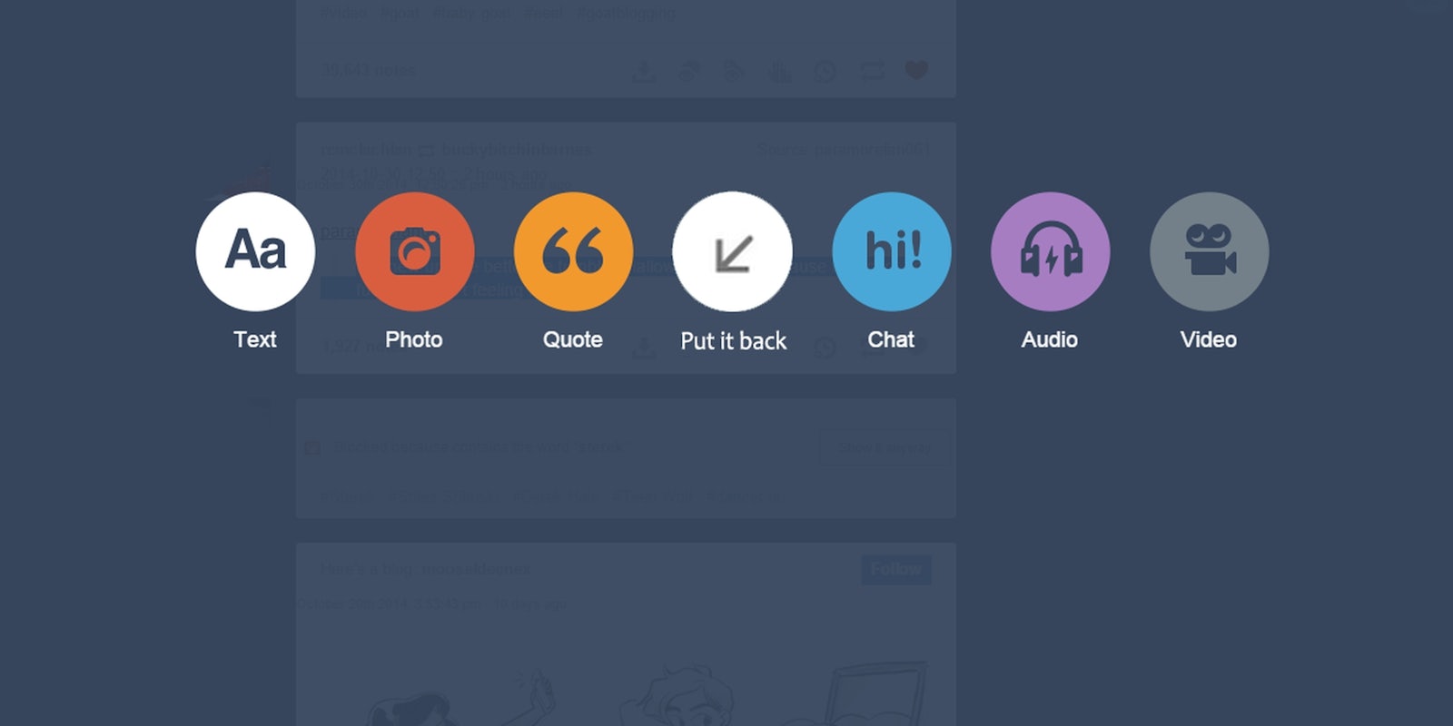
It’s no wonder that Tumblr users freaked out when they logged on and saw a new dashboard full of extra-blurry, uneven, and unfixable images. Tags like Tumblr why, Tumblr no, and put it back are all filling up with angst and despair.
Tumblr is known for rolling out interfaces with bugs and glitches, but it seems like the image-resizing issue is an obvious bug that could have been beta-tested and fixed before this update left the staging area. In the wise words of paramorefan061:
this new update better be tumblr’s Halloween costume cause it’s scary as fuck and i ain’t feeling it.
It’s a hard time for all of us, paramorefan061. But if Tumblr’s past is any indication, it will probably roll out updates to the update that fix most of the major issues—again, silently and without warning—and we’ll be back to complaining about why we don’t have a Tumblr outbox. In other words, business as usual.
Illustration via galacticdragons/Tumblr


