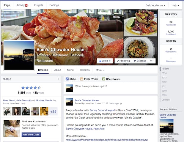
Facebook has announced a plan to revamp the look of Timelines on its Pages, moving to a one-column design more similar to the Timelines on individual profiles. (Quick reminder: Pages are generally public and can be for a person, business, movie, etc., while personal profiles are just for individual use.)
Here’s the new design:

This is a little change, but it illustrates that Facebook is making a concerted push to give itself a streamlined, stripped down look. It also further blurs the line between a personal account and a Pages account, which makes sense. Facebook would prefer that its users treat their individual accounts more like Pages anyways, publicly posting and sharing content, so this will help reinforce the idea that Pages aren’t so different than regular accounts (which is a lie, Pages are inferior).
In addition to giving Pages an easier-to-navigate makeover, Facebook also gave administrators more control over the look of their layout. The new design allows users to move sections around to create a custom look. Remember, this is the same Facebook that swore off giving users too much control over the look of their individual profiles to avoid people from cluttering their profiles with garish color schemes; it appears Facebook is more willing to cater to customization now.
Facebook is doing two things right here, by simplifying the design and giving users more control. The main Facebook service often feels overstuffed, so it’s important that the site’s scaffolding doesn’t add another distraction. At the same time, even as the company looks for ways to make its design more elegant, allowing users a few options to put their own spin on the look keeps people engaged.
Now if only Facebook would consider offering an option to browse without a News Feed… right now you have to use an obscure script called “Quiet Facebook” to remove the cluttered stream from your profile-creeping experience.
H/T Inside Facebook | Photo via Flickr/Facebooklet (CC BY 2.0)


