A few eagle-eyed Redditors have spotted a subtle change to Google‘s logo.
Can you spot the difference?
Here’s how the logo looked Friday:
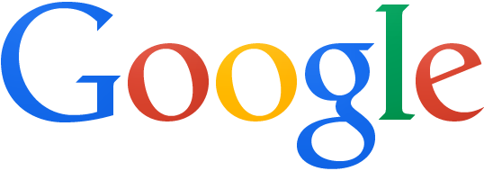
Photo via Google
And here’s how the new version looked the next day:
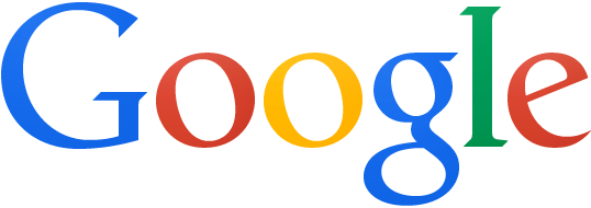
Photo via Google
Can’t tell what changed? That’s because not much did. The ubiquitous logo repositioned the “g” one pixel to the right, and the “l” of its name one pixel right and one pixel down.
Here’s a before/after, courtesy of G+ user Ron Amadeo:
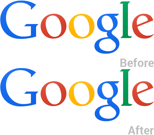
GIF by Ron Amadeo
So what difference does the change make? A lot, in terms of readability and decipherability. For font aficionados, what Google did is simple: it adjusted the kerning so that the letters are more evenly spaced. In the immortal words of XKCD:
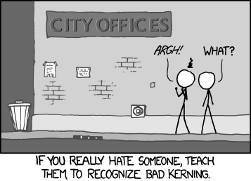
Illustration via XKCD
While it’s not clear what prompted the change, we like to believe Google promoted a designer whose secret wish had long been to execute the change. As redditor nal1200 observed, “The bottom of the ‘l’ and ‘e’ did not line up horizontally and that, my friend, must have driven some design employee crazy.”
This isn’t the first time Google has tweaked its logo: Recently Google dropped the longtime textural effect that had characterized the look for most of its 16-year history:

Photo via Google
The new look is cleaner and more browser-friendly. And now it’s easier on design buffs, too.
Photo by stshank/Flickr (CC By 2.0)

