A lot of social media sites have been getting redesigns lately, and Pinterest is one of the few rolling out their new look slowly and receiving a mostly positive reaction as a result.
In March the website announced everyone would have the chance to try the new look after a small group of pinners successfully tested it. Ever since, they’ve been listening to feedback and making improvements along the way, updating their blog each week with the latest changes, but what does that mean for users?
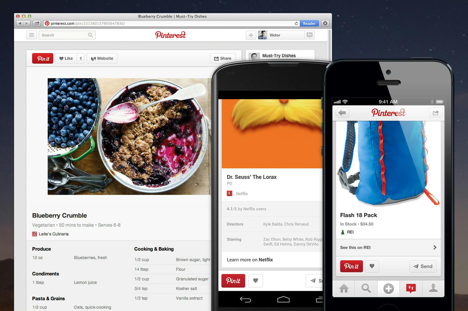
Users can opt in for the new design by clicking “Get it Now” on the notification at the top of the screen. If you accept it, you’ll notice a subtle change on your home and profile pages. The new look is supposed to make the site cleaner and easier to manage. It achieves this by streamlining its look, moving much that used to clutter the left side of the homepage up top to make room for the slightly larger pins. It’s not a huge change but the larger size does take advantage of the pins visual elements, making the images even more striking.
Your notifications are now on the upper right corner of the page, letting you look at your recent and past activity, and categories are available in a handy drop down list on the upper left corner. Search has also been updated with an auto suggestion feature similar to Google and you can now find friends from Facebook and Twitter on the site.

Photo via Pinterest Blog
While the changes are subtle, it will still take users awhile to adjust to the new design. The largest adjustment will be to the changes on the pins itself. Now when you repin, you can see what others have pinned from the same website as well as what else is in the board the pin belongs to. This makes it easier to find similar content you might be interested in. Some pins will also now have more information. You’ll be able to find these by an icon that will appear below the picture.
As for mobile, the new look is being rolled out there as well and a new Pin It button is being added in mobile apps, to increase the ease of pinning on the go.
The most impressive part of the redesign is how it is evolving as Pinterest hears from its users. At first they got rid of the “pinned via” option but so many users complained that it has now been added back in. Many people also expressed interest in a notification telling them when they’ve already pinned something so they can avoid duplicate pins. Pinterest added that feature in as a result.
Most users seem to be pleased with the new design, partly because of the clean look and partly because the site is listening to them and making changes based on their input. On the Pinterest blog, there’s a constant discussion between users and the company as people share their thoughts on what they’d like to see and what they think of the redesign.
Perhaps more noticeable than the few positive comments out there is the lack of negative reaction to the redesign.
This is in marked contrast to other redesigns including Google+, which saw an almost even mix of positive and negative comments posted online when the site changed its look last week. It’s possible that finally a social media website found the formula for redesigning itself without angering users in the process.
Screenshot via Pinterest


