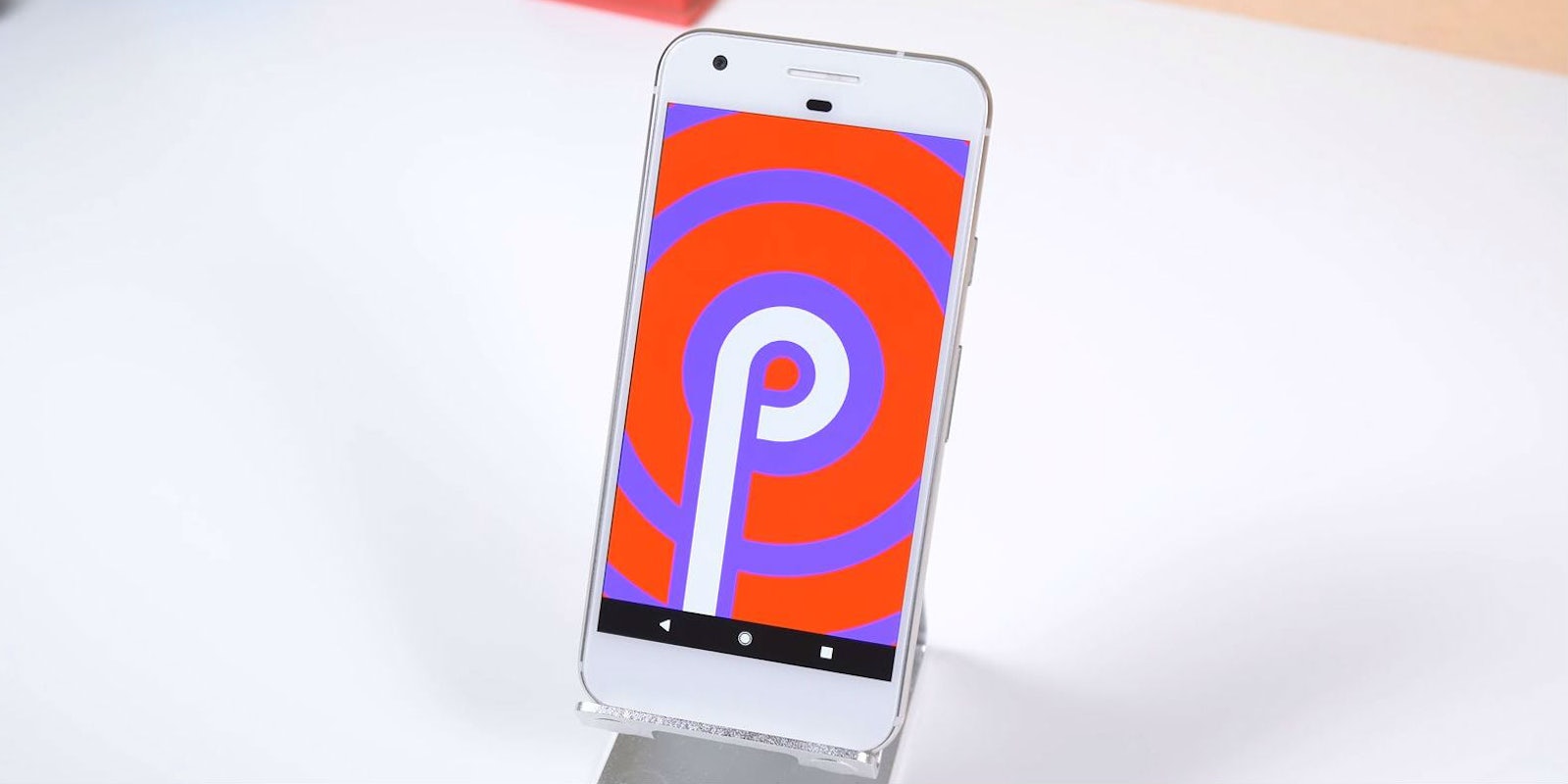
Android P is shaping up to be one of the biggest mobile operating system updates in Google history. We already knew the company would bring some exciting features to the table when it released a developer preview of the forthcoming operating system in March. But the most significant changes were revealed earlier this week when Google CEO Sundar Pichai took the stage at the company’s annual I/O developer conference.
At I/O, Google showed how its next major update will transform Android’s user experience with a new interface, productivity features, and tools to help you disconnect from your device. Here are the five features we’re most excited to see when Android P launches later this year.
The 5 best Android P features
1) iPhone X-like gesture navigation (and a new home button)
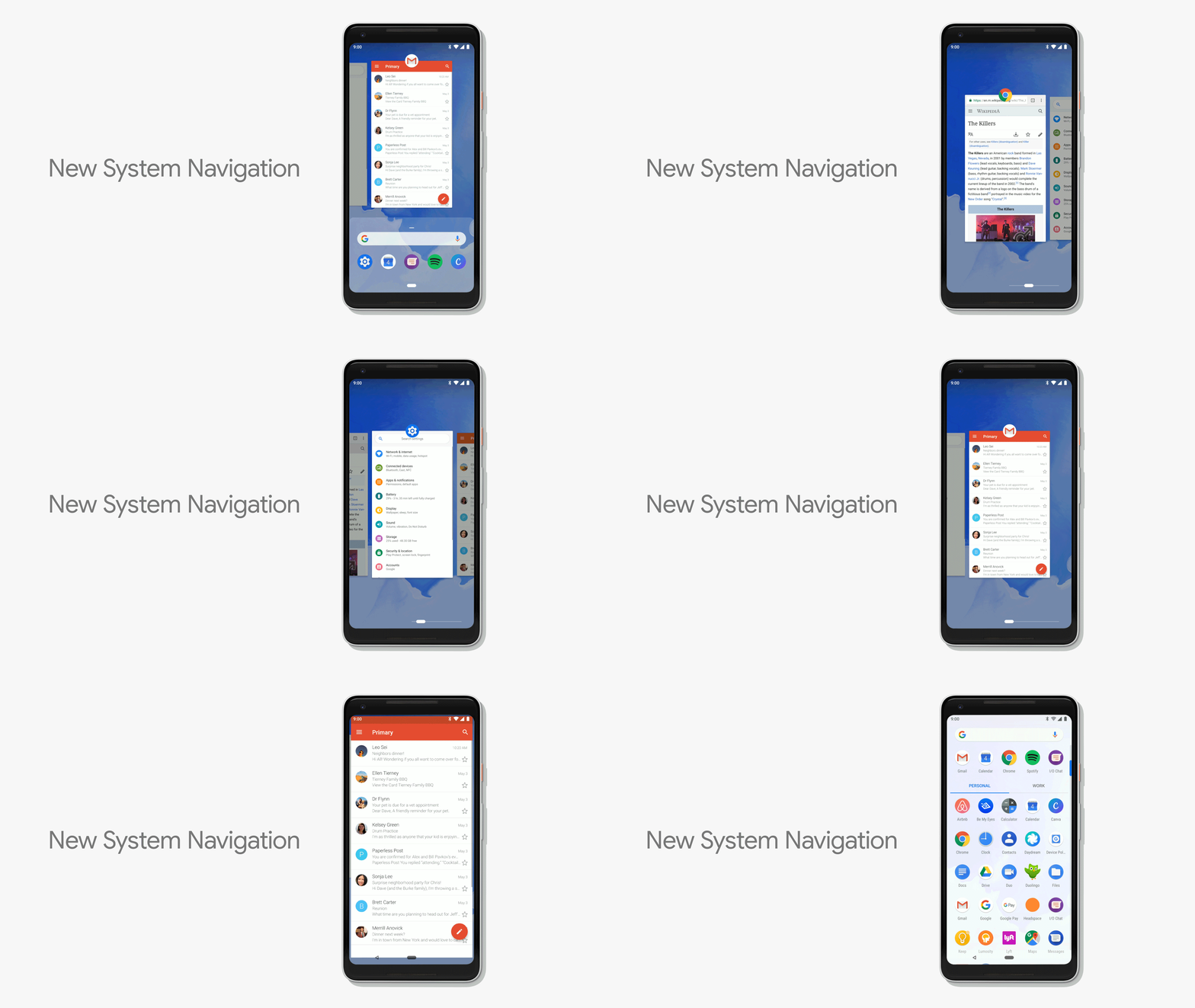
One of the biggest changes coming to Android’s UI is a new home button for gesture controls. An oblong slider will replace the old on-screen home icon that has been around for years. Also, the right on-screen multitask button that pulled up your active apps (Google called it “Overview”) will thankfully disappear, and the back button on the left will only show up when apps are active.
Now, a half swipe up from the new home slider will show you a preview of your active apps and a full swipe will take you to the app tray. Swiping the slider to the right lets you scroll through your open apps. Google will be tinkering around with the gestures and release more in the coming months.
Like iOS 11 on the iPhone X, these gestures might take some getting used to, but once you do, browsing through Android should be more efficient than ever.
2) Well-being tools for phone addiction
Amid concerns about addiction to social media, Google is launching a suite of tools designed to give control back to Android users so they can spend quality time away from their devices.
It might seem counterintuitive for a mobile OS developer to help users put down their phones, but addiction is becoming a serious issue among teens. Pichai explained it’s part of the company’s well-being initiative that’s centered around four main tenets: to help users understand their habits, focus on what matters to them, switch off and wind down, and find balance with their family.
“Based on our research, we know that people feel tethered to their devices,” Pichai said.
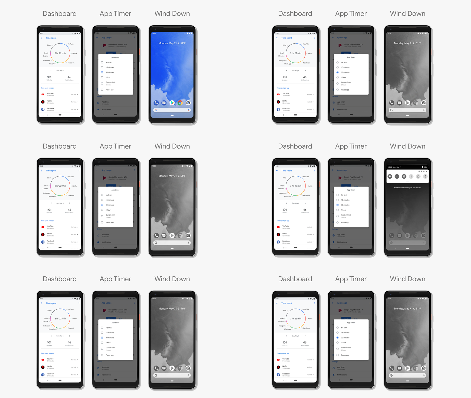
The company hopes to reduce phone addiction with Dashboard, a new feature where you can manage how much time they spend on your devices. Dashboard displays how many minutes you’ve used your phone per day, how many notifications you’ve received, how long you use each app on your phone per hour, and it even includes a pie chart of general app usage.
Other related features include “Shush” mode, which turns “Do Not Disturb” on when the device is sitting screen down on a flat surface. Google will also add App Timer to Android, a feature that lets you set a time limit for how long you spend on the app. When the time expires, the app gets grayed out. A similar feature, Wind Down, lets you set a bedtime for when the phone turns on “Do Not Disturb” mode and grays out its display.
READ MORE:
- 5 reasons why I’m glad I switched from iOS to Android
- The best keyboard emoji for Android
- How to download the best Android phone ringtones
3) New volume controls
The new volume controls will now default to always adjusting media audio, which includes apps, videos, and other multimedia content. Before, it would sometimes switch to the less commonly used Ring or Alarm volumes.
uh. moving the on screen volume controls next to the volume button might be the best new Android P feature? pic.twitter.com/KBkGGijHmX
— anyprophet (@anyprophet) May 9, 2018
The on-screen interface for volume controls will also be moved closer to the hardware buttons so you can easily move the digital scroll bar after activating it with a single button press. Google is reportedly adding a hardware feature that lets users switch all volume options to vibrate by pressing and holding the power and volume up buttons.
4) New screenshot tool
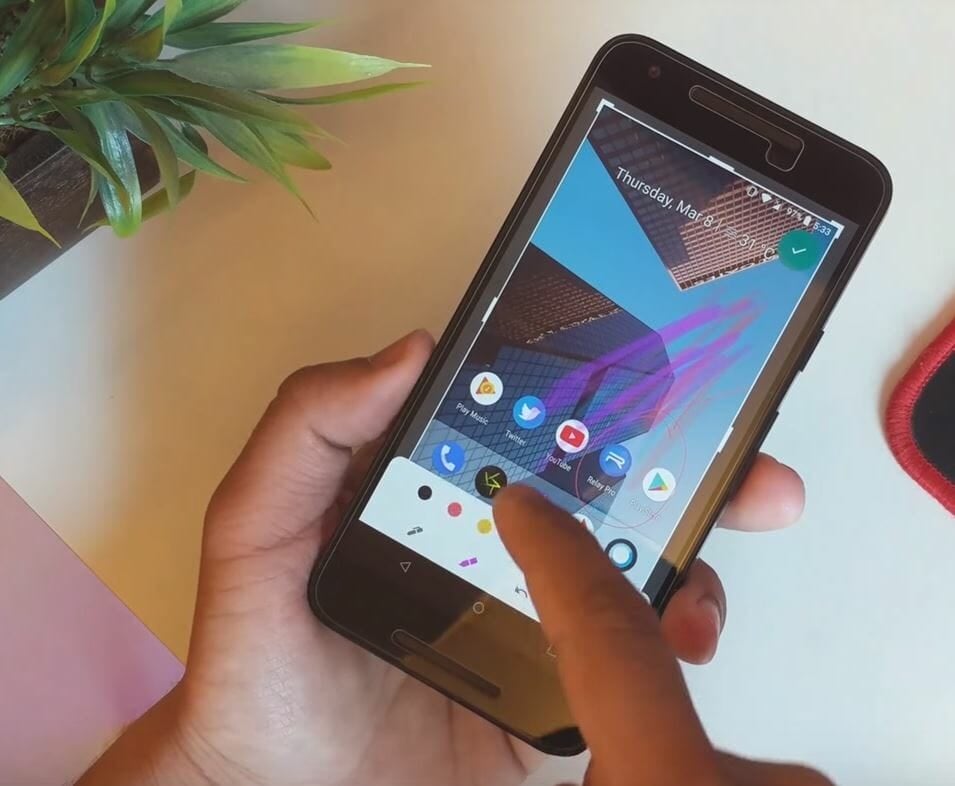
Android P brings a full-fledged editor to screenshots so you can make adjustments without having to open another app. Called Markup, the feature lets you crop and annotate images without needing to save them.
READ MORE:
- Google’s Project Fi is the best cellphone plan you’re not using
- The best Project Fi phones, ranked
- The simple way to take a screenshot on Android
5) Actions and Slices
The Actions and Slices app features may be difficult to grasp at the moment because there aren’t many examples to point to. Just keep in mind, both were designed to expand where and how you interact with apps.
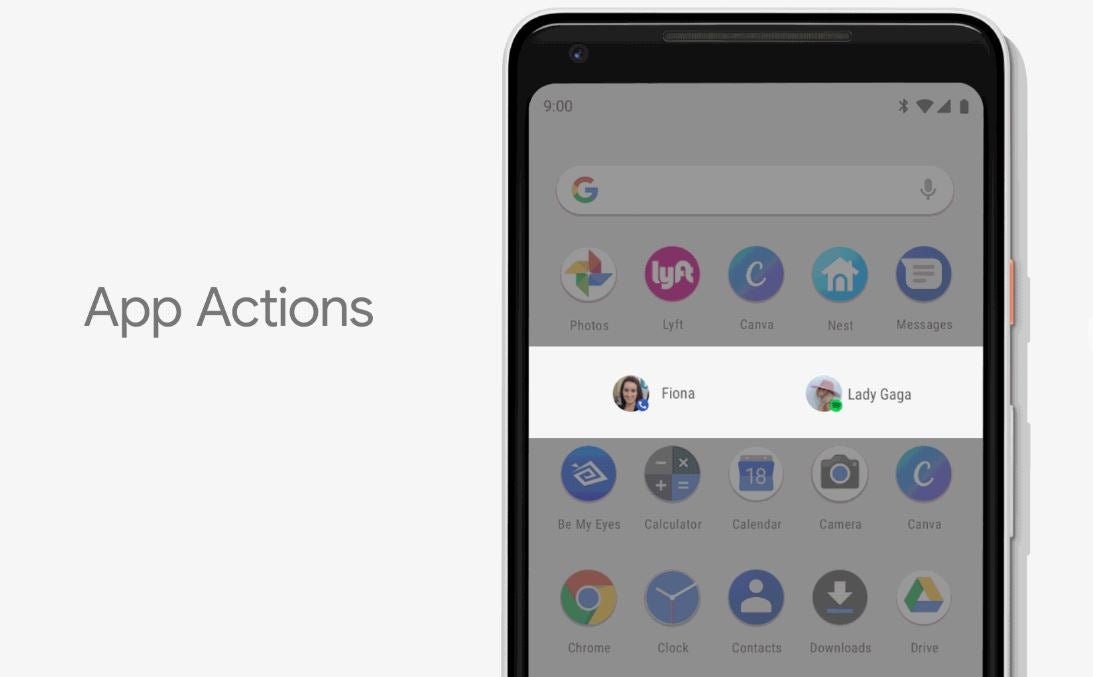
With Actions, Android will use AI to learn what you do within apps at certain times of the day and recommend specific actions via shortcuts. These will appear in the Android P search bar, Play Store, within Google Assistant, or on your home screen. For example, if you listen to the same song at the same time every day in Play Music, Google might start showing you a tiny play icon right on your home screen. Or if you call your mom on Sunday mornings, your Android P phone might display a dial icon at those times.
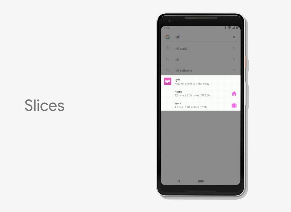
Slices is similar in that it lets you use app features from different locations. When you search for an app in Google’s search bar, you’ll be shown a “slice” of a common action for that app. For example, if you Google search “Lyft,” you might see a small icon where you can hail a ride. This can be done without ever going into the app.

