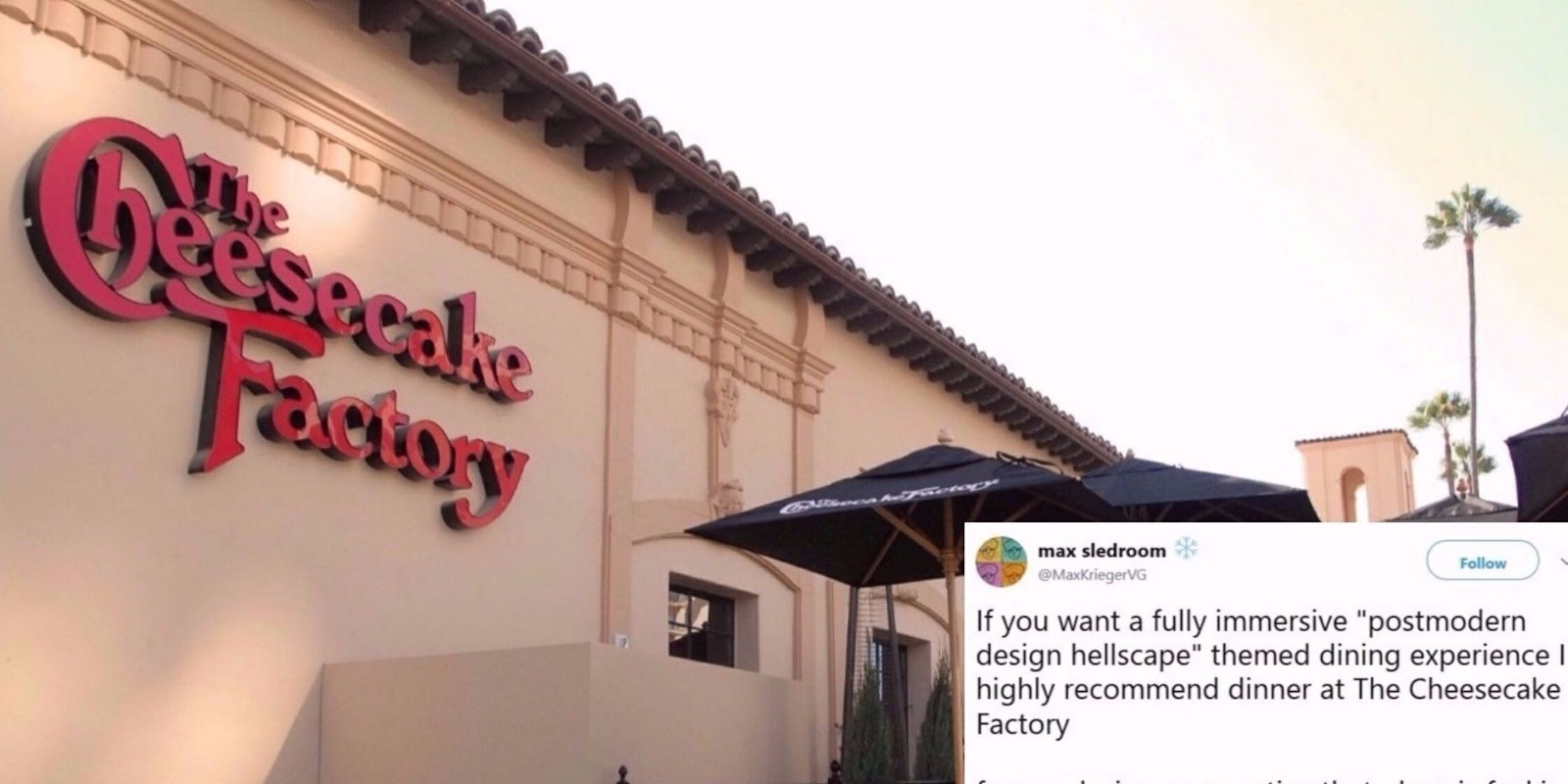
Going to the Cheesecake Factory for a meal is fine. Yeah, it’s a little ostentatious and the dome on top of the restaurant always seemed a little out of place, and OK, the menu is ridiculously long and needlessly complicated. But it’s OK, because the food is good enough. And sometimes, that’s enough of a reason to patronize a chain restaurant if your creative juices have been consumed by your hunger pains.
Twitter user @MaxKriegerVG, though, believes we need a true breakdown of the Cheesecake Factory’s exterior and interior architecture choices, the menu’s obtuseness, and what the restaurant thinks you should experience. And thank goodness for Krieger, because he’s woken us up to this reality.
The Cheesecake Factory is a goddamn nightmare.
If you want a fully immersive “postmodern design hellscape” themed dining experience I highly recommend dinner at The Cheesecake Factory
— 〽️ax krieger is building meter (@MaxKriegerVG) November 17, 2017
from a design perspective that place is fuckin wild and I’ll talk a little bit about why pic.twitter.com/0RHFDjKsuo
The Cheesecake Factory essentially grew out of a Los Angeles bakery business. Then, in 1992, they brought on hospitality designer Rick McCormack and shit went off the rails
— 〽️ax krieger is building meter (@MaxKriegerVG) November 17, 2017
We’re talking VICTORIAN-EGYPTIAN-ROCOCO OFF THE RAILS
I mean check out this exterior
— 〽️ax krieger is building meter (@MaxKriegerVG) November 17, 2017
greco-roman cornices, seashells above the pseudo-arched doors, topped with a dome airlifted from fucking st. basil’s pic.twitter.com/A7gweGu2Y5
The interior is a world of aesthetic chaos that feels like a mix between a Fry’s Electronics, an overgrown Panera, and a laser tag arena. It’s /sensational/.
— 〽️ax krieger is building meter (@MaxKriegerVG) November 17, 2017
Palm trees sit aside 2000’s-chic glass lighting fixtures, French limestone floors, mosaics, fresco-like murals… pic.twitter.com/kRgFHQh0zw
Pseudo-Egyptian faces top columns with hybrid palm frond/lotus blossom designs and pseudo-heiroglyphics. It’s unchecked white exoticism/orientalism run amok w a huge budget. Some elements like the face’s “third eye” and the Sauron-like sconces borderline on occult flavor. pic.twitter.com/gXIxT4yfr4
— 〽️ax krieger is building meter (@MaxKriegerVG) November 17, 2017
TCF blasts you w/ a “luxury dining” aesthetic while cutting some /bizarre/ corners.
— 〽️ax krieger is building meter (@MaxKriegerVG) November 17, 2017
They serve you water in tankards, seat you in wicker chairs at marble tabletops.
Then you realize your tankards are plastic, your wicker is plastic, and your table is vinyl-lined particle board. pic.twitter.com/5sxUl4I8Fj
Both ostentatiously gaudy and consistently cheap, from the fake plaster walls to the fake wicker chairs, TCF is almost reminiscent of a theme park. The more you stare at this and see elements like the tacky booth cushions and glass dividers slowly emerge, the more surreal it gets pic.twitter.com/9c802tJ0H4
— 〽️ax krieger is building meter (@MaxKriegerVG) November 17, 2017
The unchecked frenetic design doesn’t stop there. Look at the goddamn menu.
— 〽️ax krieger is building meter (@MaxKriegerVG) November 17, 2017
Or should I say FOUR MENUS – menu, “skinnylicious”, drinks, cheesecakes (not desserts, that’s different!)
It is the most intentionally obtuse culinary document I’ve ever seen. It wants to DISORIENT YOU pic.twitter.com/8kOIzhc2XO
-“Quick Bites”
— 〽️ax krieger is building meter (@MaxKriegerVG) November 17, 2017
-Appetizers
-Glamburgers
-Specialties
-Pasta
-Sandwiches
-Steaks/Chops/Fish/Seafood
-Pizza
-“Super Foods”
-“Skinnylicious” (???)
are all separate sections. there is no rhyme or reason to them. this menu is not your friend. it is actively trying to mislead you.
mid-menu advertisements for the RESTAURANT YOU HAVE ALREADY CHOSEN TO DINE AT are frequent and deliberately make you lose track of your spot
— 〽️ax krieger is building meter (@MaxKriegerVG) November 17, 2017
here’s one, w/ an entire page of flavor text
this thing feels like a god damn playbill. all the tcf’s a stage, and we are but its players pic.twitter.com/loS7e3AUYe
To conclude:
— 〽️ax krieger is building meter (@MaxKriegerVG) November 17, 2017
There is nothing more quintessentially “American capitalism” in flavor than The Cheesecake Factory
Wealth run wild. Chaotic visual fantasies realized w no aesthetic discipline. An obsession with appearance of luxury. Gross excess that excels at feigning its quality
Eventually, Krieger ordered his food, and like we said in the first sentence of this piece, it was just fine.
“After wandering the menu a while, helplessly, you order and the food arrives,” he tweeted. “It’s good. not bad, not great, but good. Better than an Applebee’s, better than a Friday’s. I wanted to say I hated it, but in truth, I couldn’t. That was probably the most disappointing part of all.”
Nah, that’s the wrong attitude to take. People don’t go to Applebee’s or Chili’s for the scrumptious, gourmet food. They go because it’s cheap and easy and you know what kind of quality to expect (even if the quality is mediocre or less than).
I was wrong earlier when I wrote Cheesecake Factory is a goddamn nightmare. In reality, that exterior dome serves as a strip-mall parking lot beacon that calls out to those who absolutely need to realize this fact of life: Sometimes, a chain restaurant that’s better than average is a goddamn revelation.


