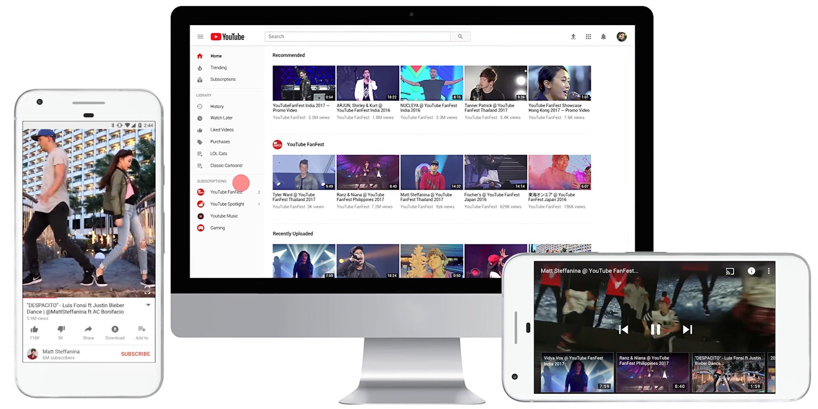
YouTube is getting a new look and a bunch of features to help transition it from a place to watch cat videos to a platform where musicians, entertainers, comedians, and vloggers can make a living. It was only a matter of time before the world’s largest streaming platform overhauled its dated app and website to accommodate its growing footprint.
“Over the last few months we’ve started releasing updates and will continue to throughout the rest of the year,” Neal Mohan, chief product officer at YouTube, wrote Tuesday in a blog post. “When all is said and done, we’ll bring a new level of functionality and a more consistent look across our desktop and mobile experiences.”
To start, YouTube is redesigning its logo for the first time in history. Instead of the red play button sitting above “Tube,” it will now be on the left of an all-black “YouTube.” This will deemphasize the word tube—a nod to the vacuum tubes that used to power old cathode ray TVs—and draw people to the play button, a symbol used on many of Google’s apps.
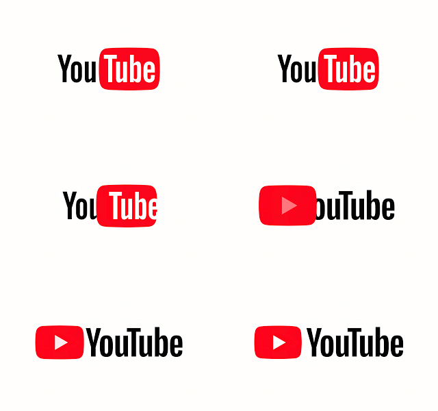
“We felt, because of all that growth, we were missing the mark. We wanted to make something more unified and cohesive, something that really reads as YouTube,” Christopher Bettig, head of YouTube’s art department, told the Verge. “We were hoping to build a visual language that would make it easy for folks to recognize it.”
YouTube claims the new logo works better across different services and platforms, particularly on smaller screens because it can be abbreviated and remain distinguishable. It’s a subtle change, but one that will be noticed immediately by YouTube’s 1.5 billion monthly users. The change is out on desktop Tuesday and other services soon.
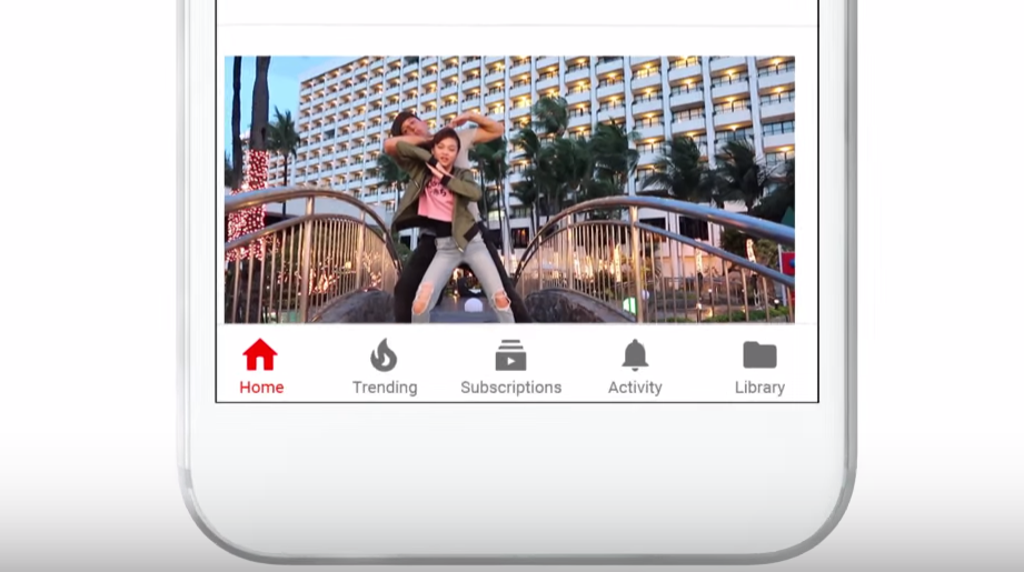
Other aesthetic changes include a cleaner mobile app with a white header designed to let content take center stage. The navigation tabs are also being dropped to the bottom, making them appear a lot like those on Instagram’s mobile app. The “Account” and “Library” tabs are now separated to add clarity.
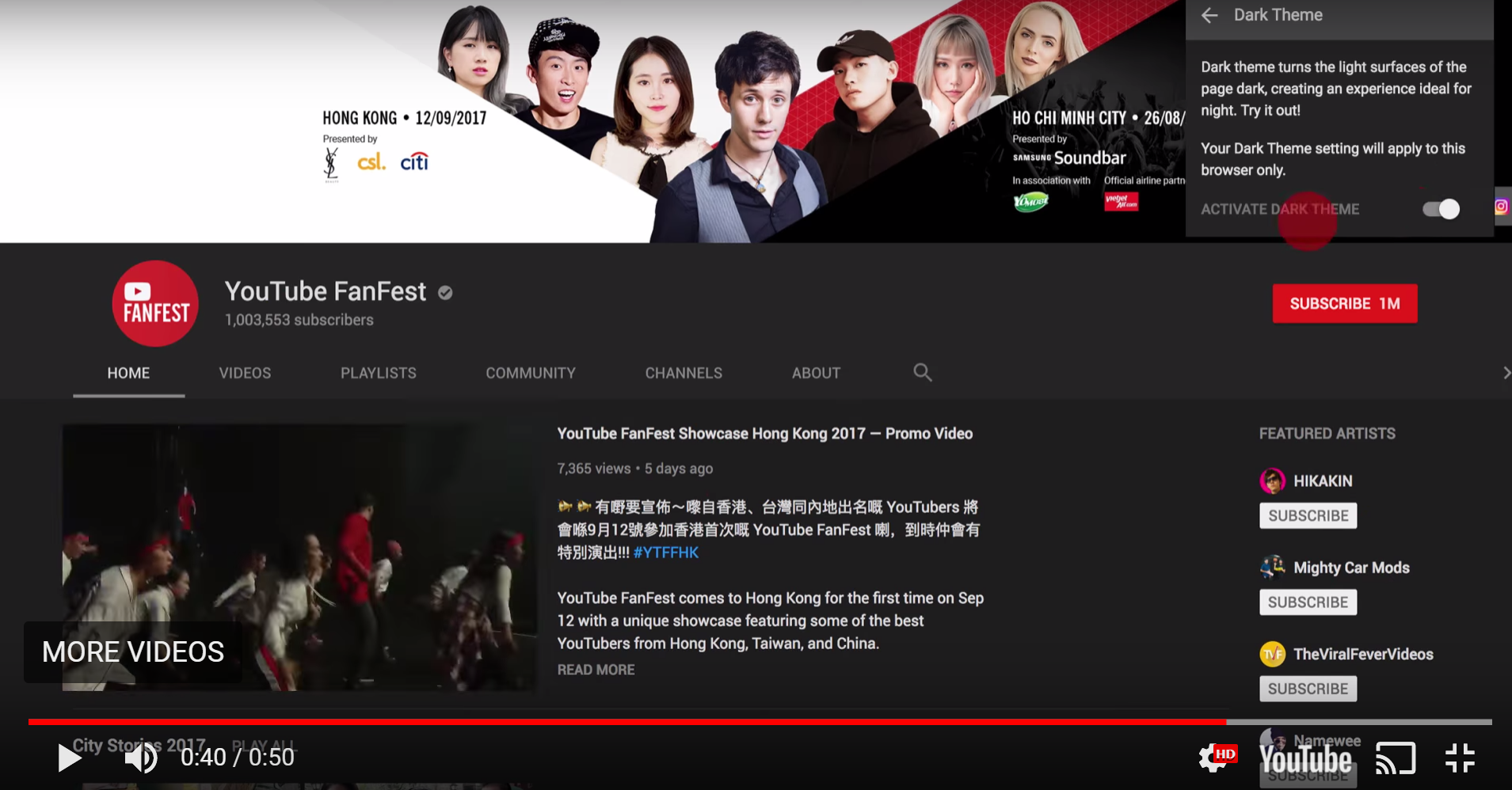
On desktop, there is a new typeface, color scheme, and several other small design changes inspired by Google’s Material Design language. Perhaps the most significant change on desktop is the introduction of Dark Theme, which makes the background black when watching videos to give them a cinematic look. You won’t notice a difference if you watch your movies in full screen mode.
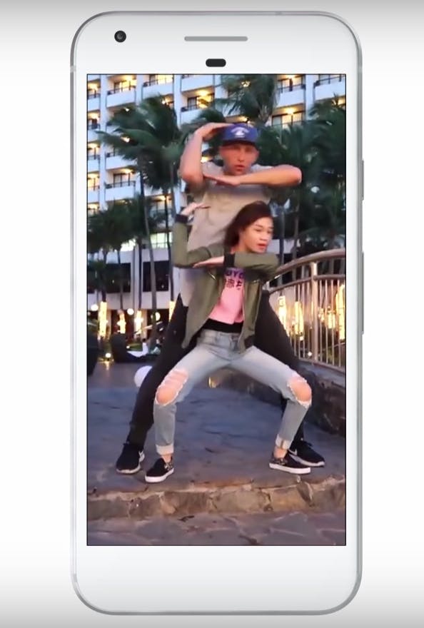
Along with the redesign, YouTube is releasing a series of new features to unify its platforms and emphasize content. Mobile users will be able to use gestures to control video playback. To that end, YouTube will expand on a feature it added earlier this year that lets users double tap on the left or right side of a video to skip or rewind 10 seconds. The gesture is used billions of times each day. Another upcoming feature enables swipe to previous or swipe to next video.
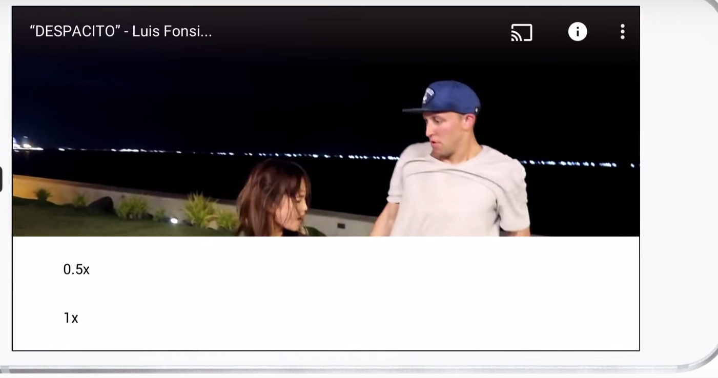
YouTube is also expanding its video playback speed so you’ll soon be able to slow down or speed up a video on the mobile app, not only on desktop. And video format compatibility is coming to mobile so those terrible, vertically shot videos will finally fill up your entire smartphone display.
YouTube hopes these changes will bring more professional content to its app while uniting its new services, like YouTube Red and YouTube TV.
Some of the new features and design changes are viewable today while others will be released in the coming months.
H/T the Verge

