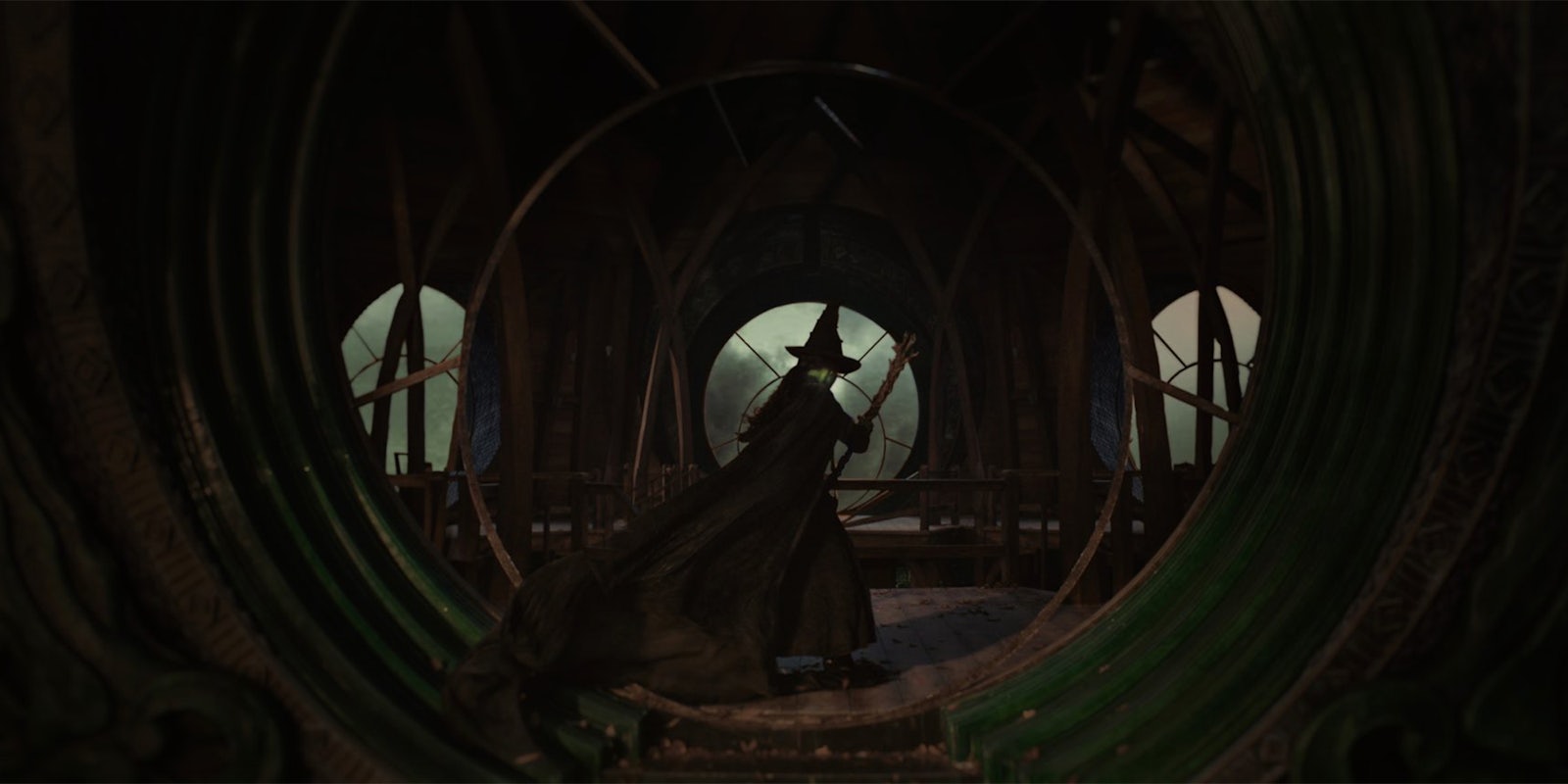
Some would argue that it’s unfair to judge an entire movie from two promotional images. That being said, the point of these photos is to advertise what a film will look like… and our first look at Wicked reflects a very unpopular cinematic trend: Impenetrable darkness.
Based on the hit Broadway musical, Wicked is an unofficial prequel to The Wizard of Oz. Musical theater fans are already hyped for this epic two-part adaptation, but when director Jon M. Chu (In the Heights) posted two “first look” Wicked images, the primary reactions were comments like “TURN THE LIGHTS ON” and “What look, we can’t see this shit.”
Some commenters also tried to lighten the photos themselves, hoping to get a better look at the costumes and scenery:
While complaints about overly dark cinematography have been brewing for a while – an obvious example being Game of Thrones—this backlash has really picked up speed over the past couple of years. From Marvel spinoffs to Netflix shows to Disney‘s live-action Little Mermaid movie, we’re seeing a lot of criticism aimed at projects with dim lighting and murky, low-contrast color palettes. This is often blamed on low-quality digital color correction and CGI, combined with a lack of institutional knowledge for old-fashioned lighting techniques.
Film buffs like to draw comparisons with mainstream films from the 20th century, arguing that older movies—even poorly-received ones like 1993’s Super Mario Bros.—featured better lighting and production design than the average CGI-heavy modern blockbuster. In Wicked‘s case, The Wizard of Oz is the most obvious comparison; a landmark moment in color cinema.
On the bright side (sorry), Jon M. Chu saw these criticisms and responded with reassurances that Wicked would be lighter and more colorful than these photos suggest.
Replying to a tweet from writer Roxane Gay (“Shame. I was excited for this but they don’t have a lighting budget. This is really infuriating. LIGHT YOUR ENTERTAINMENT SO IT CAN BE SEEN.), Chu shared a link to some behind-the-scenes photos of the Wicked set looking very colorful indeed, writing, “Trust me, plenty of colors in Oz.” So while those promo images do play into people’s concerns about gloomy lighting, they may not actually reflect Wicked‘s overall aesthetic.


