By RUSS MARTIN
With their constant exclamations (!!!) and tendency to end words with z, party promoters are the vermin of Facebook. Not content to invite thousands of loose acquaintances to club nights, they spam your wall with event details and tag you and dozens of others in photos of iStockPhoto babes and illuminated champagne bottles.
Before an event, they’ll flood newsfeeds with updates that “booths are sold out,” for parties that “might potentially be the night of the year” (an actual status from a promoter in Toronto). Then, like some Jay McInerney satire, they add, “Gonna be a wild one!” (same status).
Things have gotten so ridiculous, there’s even a meme called “promoters be like” that mocks every promise of a rager during a hurricane or snowstorm.
The event pages themselves are full of incessant slashes // between // every // word, s p a c e d o u t l e t t e r s, and dollar $igns in words that are not “Kesha.”
It’s the posters, though, that are the most bizarre, fantastic part of Facebook club promotion. In the tradition of Bad Rave Flyers, they’re always full of Angelfire-era fonts and DJs in halos of light.
Here are the worst offenders.
The fonts
This dubstep party flyer is pretty close to what you get if you search for “graffiti” on FlamingText.com, so I guess that’s how you know it’s a really good dubstep party.
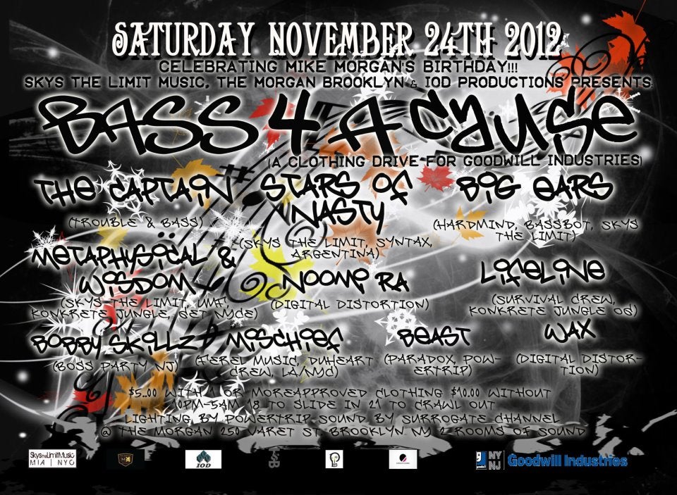
Photo via Dangerous Minds
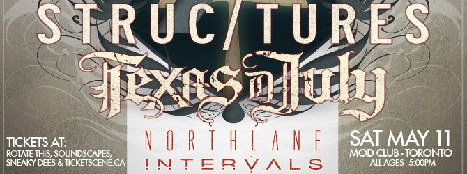
The font on this looks like it belongs on a lower back somewhere in New Jersey. At first glance it looks like it says Texas Duby, but it’s actually Texas In July, which Google says is a Christian metalcore band from Pennsylvania. Note the mandatory slash in the middle of the word structures here:
For its Halloween party, the Bounce Boat brought this nü-metal font out of retirement.
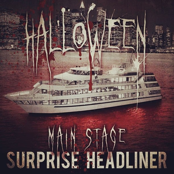
Photo via Facebook
It doesn’t usually draw inspiration from Slipknot, though. Its last party flyer had an ’80s space-age feel, and a younger, sexier version of Tron Guy was there.
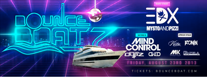
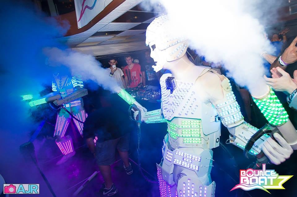
Photos via Facebook
The sad stock photos
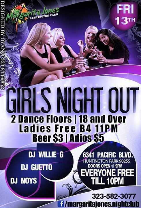
Girls Night Out is when four women in a stock photo laugh hard enough to make a salad jealous. If you want women cracking up on your flyer, just call Bryano, who designed this one. He put his number in the corner.
The terrible tag lines
The thing you need to know about Lil Ray is that he lives for parties. He doesn’t throw parties, he is parties. It’s like the flyer says, man. He puts the party in partying.
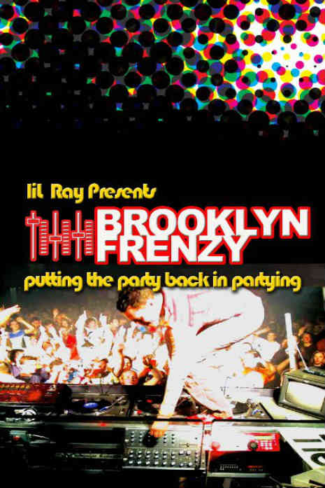
Photo via Dangerous Minds
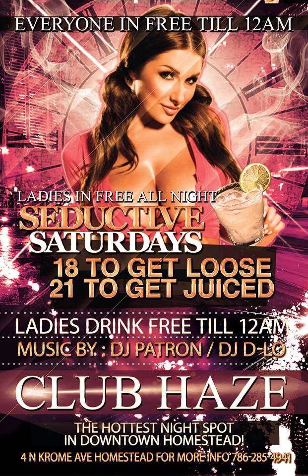
First, note that the DJ’s name is DJ Patron, which means the people who went to this party had to play their own music. Then imagine a creepy bouncer licking his lips and saying, “Eighteen to get loose, 21 to get juiced.” It was that kind of night.
The out-of-place animals
This flyer from Shanghai is an illustration, but it’s still NSFW, unless you work somewhere where it’s totally cool to look at a cartoon of a horse and two humans in a three-way. Or if you’re a party promoter for Acid Pony Club. Then it’s probably fine.
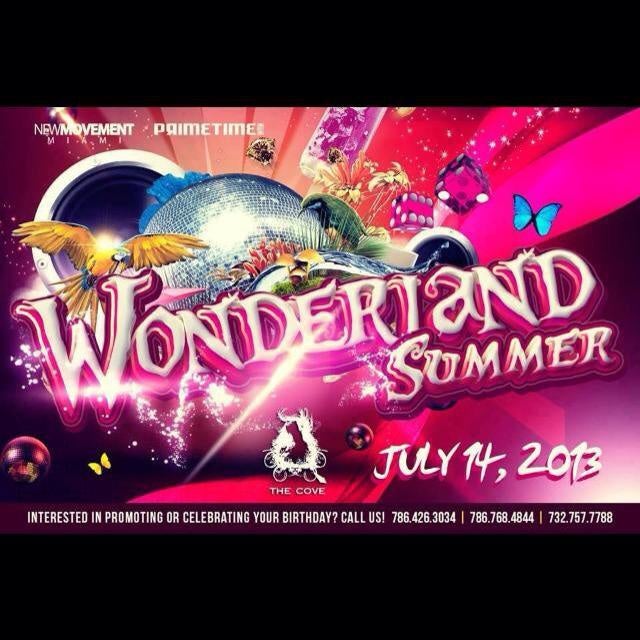
If FernGully had a casino, it would look like this flyer. The disco ball, parrot, mushrooms, dice and butterflies make no sense together until you realize Wonderland Summer was in Miami and then you think, “I bet a lot of people went to this party.”
Then there’s this. Pink Heaven is the place where all the pretty animals go when they die. Like doves. When doves die, they drink olive martinis with busty blonde women in Pink Heaven.

I’d rather hang out with these guys.
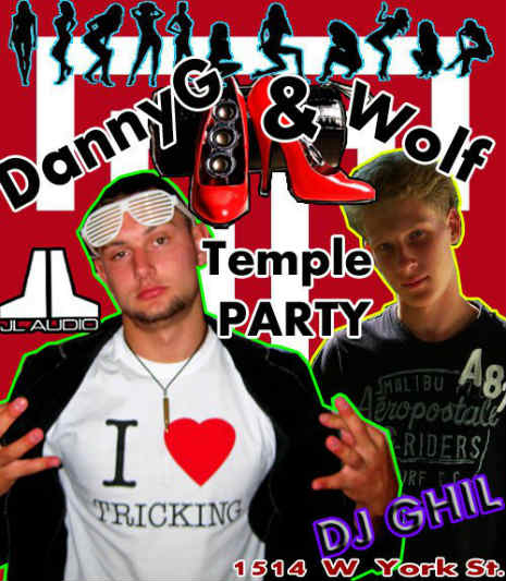
Actually, you all go have fun. I’m crawling in a hole and staying there forever.
Photo via Flickr

