Most Tinder bios are annoyingly vague and often cover matters immaterial to actual compatibility. That’s probably because these days 90 percent of them consist solely of emoji. What is one supposed to really discern about a person when all they have to go on is “😀 💅🏾 💃🏼 💃🏼 🐎 🍕 “?
With many people getting frustrated with the futility of these apps, the trend lately has been to include even less and less information. A sort of “why bother” mentality pervades.
But one user went in the opposite direction. Grace, a student at the University of Kansas, is laying it all out there in a unique way.
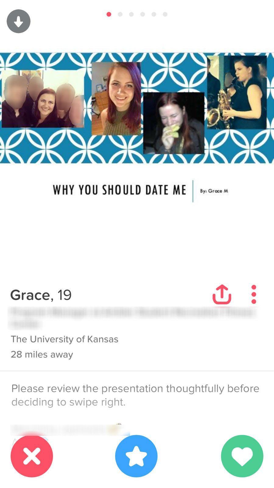
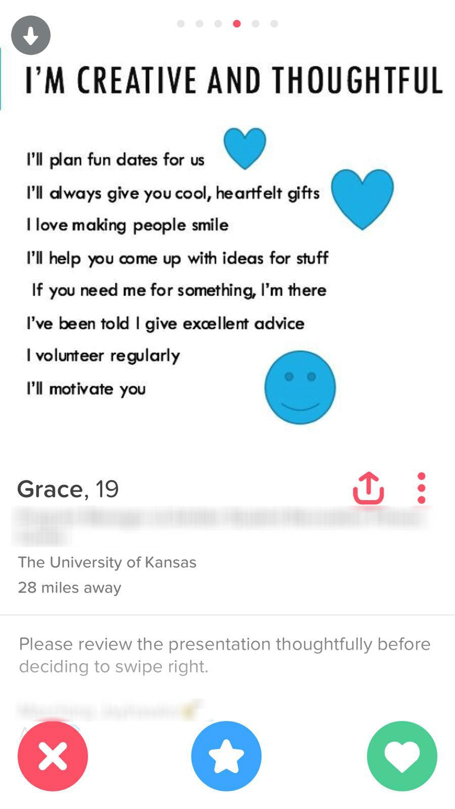
She made a PowerPoint presentation to pitch herself: Why you should date me. It’s part question, part answer, but all in good fun.
“I had been having some bad luck on Tinder, and my profile was pretty boring because I was taking it too seriously and didn’t want to look ‘weird,’” she told the Daily Dot. “I never really felt confident about my profile before, so I think it stopped me from standing out.”
She decided to try a trend she’d seen around the internet.
“One of my friends showed me a guy on a different dating app with a PowerPoint profile, and I thought it was really interesting, so I decided to use the format as inspiration for my Tinder. I’ve always been the ‘funny person’ in my life, so I decided to just take that and run with it.”
Twenty minutes later, she had six persuasive slides, all from a standard PowerPoint template.
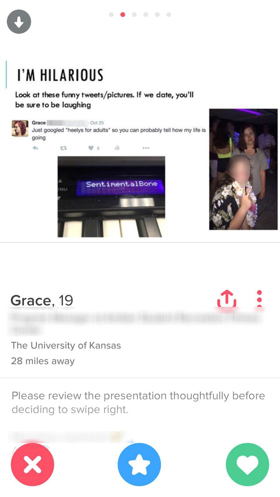
Reasons included the fact that, like she said, she is the funny one.
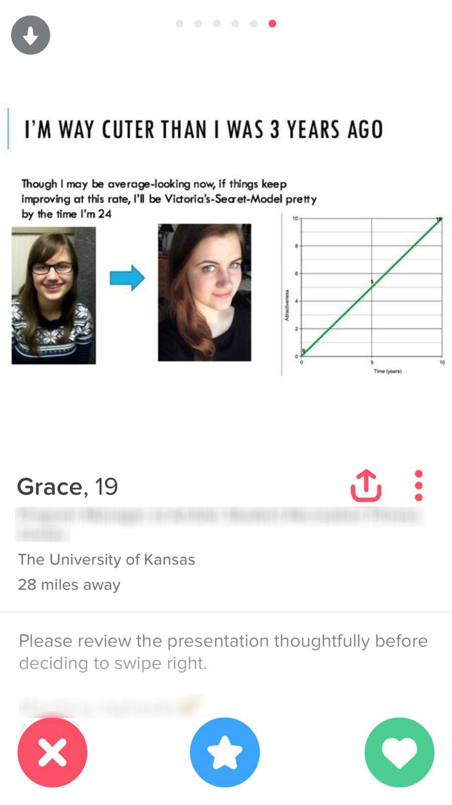
And her cuteness is growing at an unceasing linear rate.
While her Trig professor might object to that graph, it’s one of Grace’s favorite.
“I’m really proud of the ‘I’m way cuter than I was 3 years ago’ slide,” she said. “I think it’s funny, and it shows that I can laugh at myself while still saying ‘hey, I’m actually pretty cute.’”
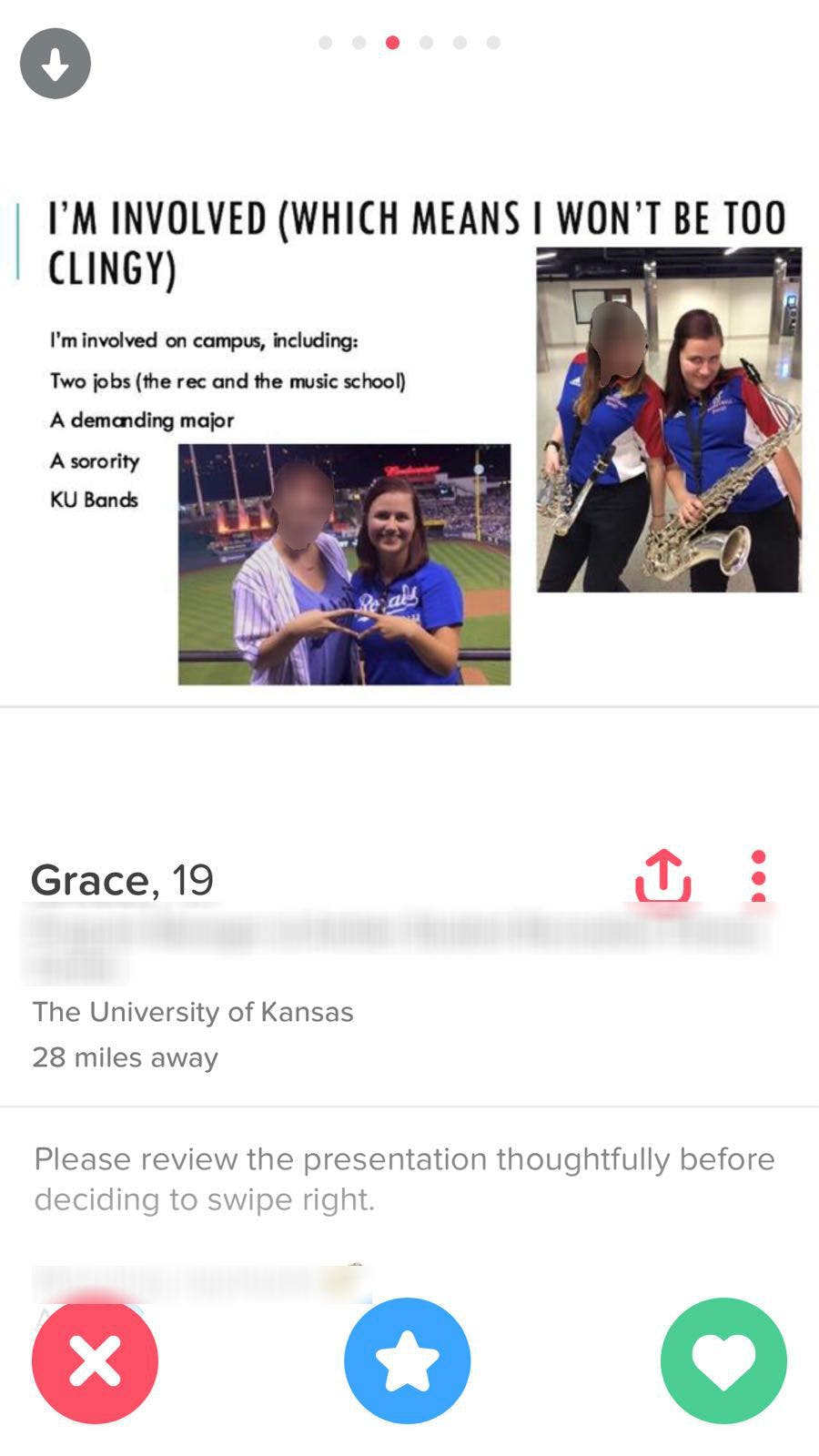
That, though, isn’t the one getting her the most swipes. She thinks it’s this one.
“Weirdly enough, I think the “involvement” slide gets noticed a lot because before I had a lot of people ask me if they knew me from somewhere (one of those faces, I guess) and that one kind of answers that question.”
Like any other PowerPoint presentation, it has that one slide that gets bogged down with too much text.
Grace said people have responded with surprise that a woman could create a funny Tinder profile, which is surely grating, but regardless, it has resulted in an improved Tinder experience.
“My favorite response is when a guy sees that we share the same sense of humor, and then we get to talking and I find out he’s actually really cool,” Grace said. “He may not have swiped right if I’d had a ‘generic’ profile, so I’m really grateful for those connections.”
It goes to show that a little effort goes a long way.
“I tried really hard to not make it boring, and instead put funny jokes on each slide. I don’t take Tinder super seriously, but I do want people to know what I’m like from the get-go so some good conversations can happen instead of the same old bad pickup lines and boring ‘how are you’s.’ “
Unfortunately, winter break cramped her style a bit, but she may have already found someone back at school.
“I’ve been home for winter break so I haven’t really been on Tinder much, but I am still talking to someone back in Lawrence that I matched with weeks ago, so I’d consider it a success.”

