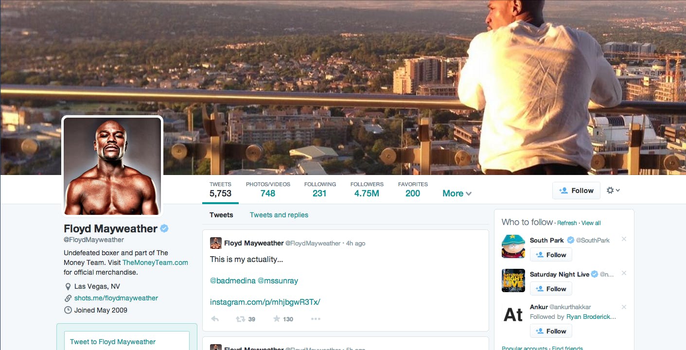
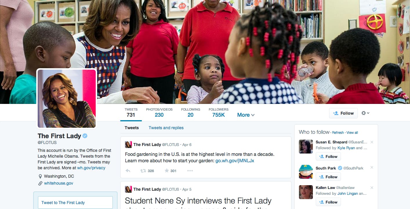
Twitter is officially rolling out a major layout change to its Web profile pages… and it’s unofficially tearing pages from Facebook’s design handbook in the process.
While Twitter doesn’t get a ton of points for originality here, the profile pages are a sleek update for the desktop experience that could boost user engagement on the Web. The once-minimalist Twitter profile landing pages have a new, busier look that highlight more information about each user. Profile background photos resemble Facebook cover photos, and the layout of tweets looks similar to Facebook’s profile feeds of posts.
The interface comes with new features: Twitter will now let users pin a their favorite tweet at the top of their profile page, and users can search tweets with a filter based on the presence of a photo, video, or @-reply. Twitter also automatically makes tweets with high user engagement larger, in an effort to single out the better posts.
The news that Twitter planned to revamp its profile pages isn’t new, but now that the rollout is officially underway, it’s clear that this is a substantial change to the social network. Twitter provided links to a few celebrity profile pages already switched over to the new format.

This Facebook-esque redesign is not the first time Twitter has copied its competitor’s style. Twitter recently introduced photo-tagging, a feature cribbed from Facebook and its photo-sharing app, Instagram.
Of course, the copycatting goes both ways. In the past year, Facebook has attempted to adopt many social networking features that Twitter popularized, from the hashtag to verified accounts to trending topics. Some of those attempts worked better than others, but all showed that Facebook was willing to abandon what made it unique to try and poach Twitter fans.
So, why did Twitter give its profile pages the Facebook treatment?
Twitter went public last year, and wants to add new users at a quicker pace, while giving current users more reasons to stay on site (like any Web company ever, really). The company is imitating its more widely-used competitor for a reason: People seem to find Facebook profile browsing more accessible than Twitter’s unceasing real-time feed. This profile update is a way to make the service more inviting for new users, who often feel locked out by Twitter’s (slightly) more complicated, often fast-paced user experience.
Will this work? Only time will tell, but I think it will. The redesign doesn’t change the functionality of profiles enough to push avid users away from the service, and it may make Twitter less daunting for new users who are drawn into the new profile’s more appealing design. The fact that this is for desktop and not mobile suggests that Twitter is targeting the kind of people who access social media through desktop: older users at work, not teenagers. Twitter doesn’t need to be more like Facebook to attract the younger demographic, since the younger demographic apparently thinks Facebook is lame. But for older people who waded into Facebook late, who feel intimidated by Twitter’s occasionally byzantine-looking feed full of canoes and hashtags, these profiles might add a reassuring element of familiarity.
And this will likely boost current user engagement, too. Many Twitter users tend to focus on the real-time feed instead of going to other users’ individual profile pages. With these profiles, users will have more reason to surf each others’ profiles, which would boost Twitter’s profile page views—a no-brainer goal for the ad-supported social network.
All that said, I hope Twitter doesn’t make a habit of mimicking competitors instead of developing original ways to increase engagement that use its native strengths. We don’t need two social networks that do the same damn thing, and if Twitter and Facebook keep ripping each other off, one of them will become superfluous.
Twitter has so much going for it, and if it can add increased profile views and lure in some new users with this redesign, that’s great. But it would be a shame if the company lost sight of what makes its service so unique and remarkable: the way it facilitates real-time conversation.
Illustration via Jason Reed


