By JAMES ELKINS
James Elkins is E.C. Chadbourne Professor in the Department of Art History, Theory, and Criticism, School of the Art Institute of Chicago. His most recent books incude What Photography Is; Chinese Landscape Painting as Western Art History and Art Critiques: A Guide. He is editor of the book series, The Stone Art Theory Institutes.
The Internet makes the entire universe visible to us. We can examine the most distant galaxies in the universe, at full resolution, seeing exactly what astronomers see. We can peer at a shaky video feed as an endoscope is pushed into someone’s stomach. We can watch live video feed from astonishing depths of the ocean floor, areas of the world never seen before by human eyes.
This vast, steep and immeasurable increase in things that can now be seen makes us all into armchair experts. Is that a vampire squid floating by in the submersible’s floodlights, or is it some new species never before seen? What’s that shape in the patient’s colon: is it a tumor, or a benign lump? Is that single faint pixel in the astronomical plate an enormous galaxy with millions of suns, or is it a grain of dust in the telescope?
In fact, we are now seeing things more closely than we should, than we were ever meant to. That is particularly true in the case of artworks that are uploaded at very high resolutions—so high that we see them more closely than the artists ever intended.
The Internet also gives us close-up looks at books. There are high-resolution scans of manuscripts like Beowulf, The Hours of Catherine of Cleves, and the Book of Kells: but from what I have seen, those only zoom in about as close as the monks who wrote and painted the manuscripts. You get. essentially, a monk’s-eye-view of the Book of Kells—which is a treat, and also historically sensible, because the manuscript would have been seen that way by the monks who illuminated it. But modern fine art is different, because some scans on the Internet surpass any reasonable, historically supported kind of viewing.
The best example of this is the Google Art Project. As the New York Times observed back in 2011, the Google Art Project is a monumental work in progress. Each museum contributes some ordinary high-resolution images of artworks, and Google brings in a sp ecialized machine to photograph one artwork in stupendous, ultra-high resolution. If you visit the site, you won’t know which of the artworks in each collection has been given the special treatment—until you zoom in. If you can keep clicking, and the image keeps expanding, then you have found the Google Art Project image. As the site expands, the sheer number of images obscures the existence of these few ultra-high resolution images. As critic Roberta Smith says, “the images start sliding past like butter.”
Here is one example of the over-the-top seeing that the ultra-high resolution images make possible. If you go to the Google Art Project site and find Georges Seurat’s painting, Sunday Afternoon on the Island of la Grande Jatte, in the Art Institute of Chicago, you’ll see a screen-sized version. (Try opening another window and following along.)
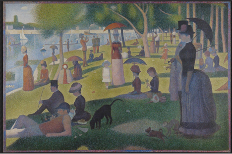
When you click to zoom in, you see are two women in the middle distance. Seurat wants us to see they are lying in the shadow of a tree.
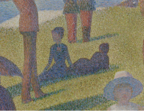
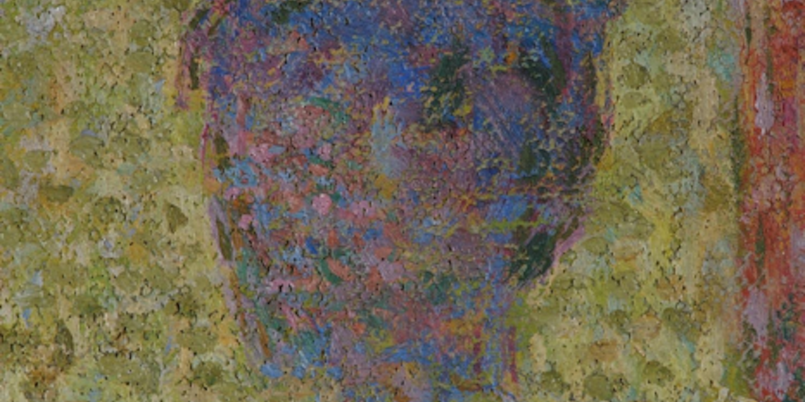
That is more or less what you will see if you go to Chicago and stand in front of the painting. But the Google Art Project lets you continue to zoom, until the woman’s face is revealed as a strange mosaic of colors:
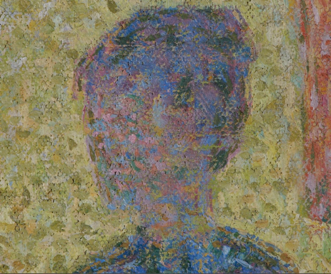
What a strange face this is. The woman seems to have eight or ten lavender-colored eyes, a bit like a spider. Clearly Seurat did not expect people to see this. But what, exactly, did he want people to see? That is not at all a simple question; in fact, it’s one of the oldest and most important tenets of art criticism. For consideration of a piece of art in these terms, Google Art Project doesn’t help at all. You cannot tell what the limits of ordinary vision are. For that, you have to go to the original.
The Google Art Project image is a zoo of oddities. That cute little white dog in the distance, for example, also turns out to be a monster—something like a cross between a spider and a rhinoceros. There are many things in this painting, as in most, that Seurat did not want people to notice. They are all effects of his “dots”: if you look too closely, they don’t combine in your eyes, and as Goya once wrote, “the sleep of reason produces monsters.” (The painting also has strange details that don’t depend on zooming in. Consider the shade these women are lying in. What tree casts that shadow?)
The painting from the Metropolitan Museum of Art that the Google Art Project has chosen to display in hyper-high resolution is Pieter Bruegel’s The Harvesters.
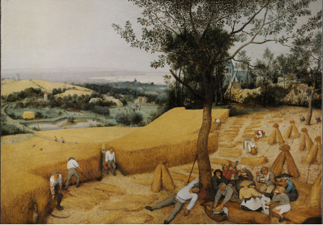
Here, viewers were expected to see and notice many details, such as the people playing in the green field in the distance. Like other painters of his time, Bruegel liked to “hide” things in his paintings, including men “doing their business.” (Those are the words of Karel Van Mander, an early historian of Flemish painting.) There is such a figure in this painting, just to the left of the house that’s on the far side of that green field. Bruegel might well have expected some viewers to spot that figure, but he wouldn’t have wanted them to see him this degree of detail (image at right).
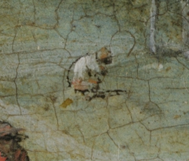
At this magnification, the man looks more like a monkey than a person, and seems to have shitted a small gold brick. Without digital assistance, this figure is just barely visible as a squatting figure. Surely that’s all Bruegel would have expected people to see.
Here is another example of the kind of problem close looking produces. In Western art after the Renaissance, paintings were sometimes left unfinished intentionally, in order to create an expressive effect. These pictures, sometimes referred to as non finito, have gaps and missing parts so that it is easy to see what the artist would have done in order to complete the work. With modern art, the idea of the non finito became more complex. Cézanne is a puzzling example. Even now, after more than a century of study of his late landscape painting, it remains impossible to say how he chose the moment to stop working. This is the way Cézanne left one of his paintings, Mont Sainte-Victoire Seen from Les Lauves.
(This one is in Basel, so it isn’t on the Google Art Project: so far all Swiss museums have opted out. There is another Cézanne of Mont Sainte-Victoire on the Google Art Project; it’s in the Phillips Collection.)
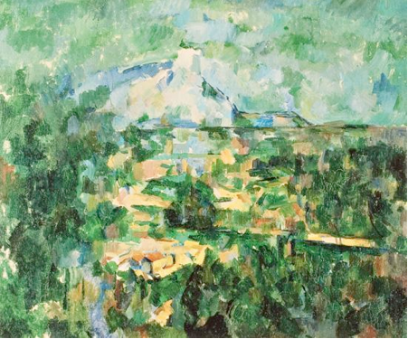
Clearly Cézanne did not intend to make a traditional, detailed landscape painting of the sort that was made in his generation. That much is obvious to everyone who looks at Cézanne. But what, exactly, is missing? What would the next steps have been?
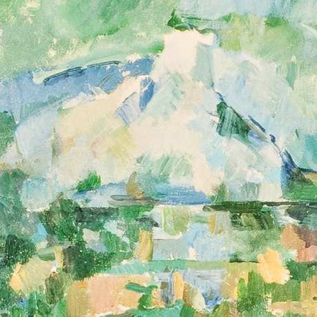
The kind of close looking the Internet encourages makes that question even more difficult than it has been: an interesting puzzle for people interested in seeing. He left the mountain strangely open on top, so it seems plausible that he made a decision not to continue painting its outline. But why? Why stop in just that place? On the right of the mountain, a series of tentative blue lines inches up the slope. Above them the mountain suddenly becomes vertical, and merges into an atmospheric mist. And yet the top has a curly green cap. Is this a kind of unnatural, hyper-magnified peering? Or is it just the kind of precise, inch-by-inch kind of decision that Cézanne wrestled with, so that he would have welcomed people looking in this way?
The more you think about this problem, the more difficult it becomes. Given that Cézanne was dissatisfied with some of his late works, and that they are all in some sense experiments, can we see what disappointed him, and where? If a lack of finish is not simply a matter of passages that are left unpainted, then how can we identify what is non finito? Because paintings like this one were never conclusively finished, it is possible the non finito portions are actually the more detailed passages, so that they lack a lack of detail. What does non finito mean when magnification shows us the non finito element of every single brush, every single dot of paint?
 If it is no longer possible to distinguish the completed from the intentionally incomplete, the ideas of process and method also become unintelligible. A painting might be constructed from absence to presence, or erased from presence to absence; there is no way to be sure. This ambiguity is part of the project of modernist painting. The Internet makes it even harder to think about than it would be when we could only see the paintings in museums, or reproduced in books.
Peering at art on the Internet is far from just a useful tool or a simple diversion: it produces an entirely new set of problems. It’s fascinating to zoom in to the Google Art Project and wonder when you have passed that invisible boundary between historically appropriate seeing and inappropriate peering. And it’s just as interesting to make use of the technology to revisit questions viewers have often asked, such as the reasons why Cézanne made just the marks he did. Perhaps one day we’ll think of the endless seeing of the Internet as a kind of cultural illness—a compulsion that future generations will find amusing. Our seeing may be pathological, but if it is, it is our pathology, our way of looking at the world.
This column is part of The Way We Think series. What happens when you get past the buzzwords and take a broader look at what the Internet is actually doing to transform our culture, our research, our tastes, and our ideas? In this series, the Daily Dot will publish major thinkers and fresh voices from diverse areas of our intellectual and cultural lives—science, literary criticism, photography, food blogging, biology, art history, wine, travel—on how our world is changing in concrete terms because of the Web.
Images from the Google Art Project and Kunstmuseum Basel

