This article contains sexually explicit material that may be NSFW.
Startups should probably be aware that any fanfare around a new logo can have unintended consequences: In Airbnb’s case, these would include observers crying copyright infringement.
Whatever the provenance of Airbnb’s design, though, we can agree on one thing: It’s weird. Some might even argue there’s a Rorschach effect. Do you see a heart, or maybe genitals?
Last night, our San Francisco community shared what #BelongAnywhere means to them. Your turn: https://t.co/E1cxl99bpb https://t.co/AWv2nCHWlp
— Airbnb (@Airbnb) July 17, 2014
Airbnb logo redesign survey: More people see hearts than naughty parts https://t.co/i1hagLnUuA pic.twitter.com/PSNCBJPzlY
— Design UX/UI (@DesignUXUI) July 18, 2014
ok this changes everything @Airbnb pic.twitter.com/soyqm9vwLW
— darth™ (@darth) July 16, 2014
The doodle-like shape is certainly versatile, as evidenced by a new Tumblr account that quickly began to compile the best remixes, most of which are fairly vulgar and probably NSFW.
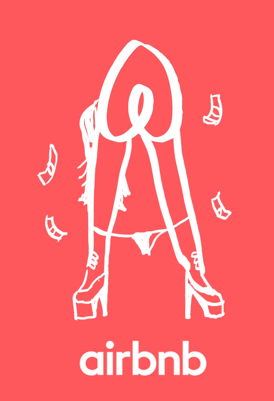

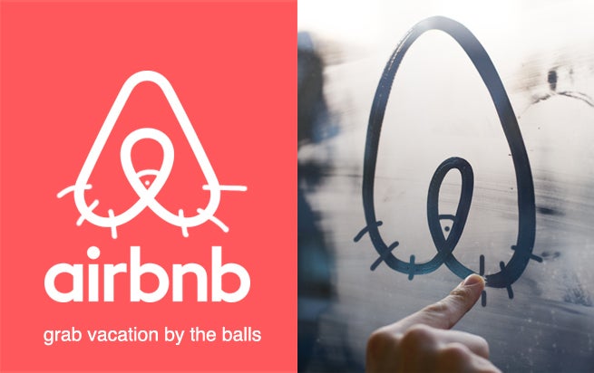
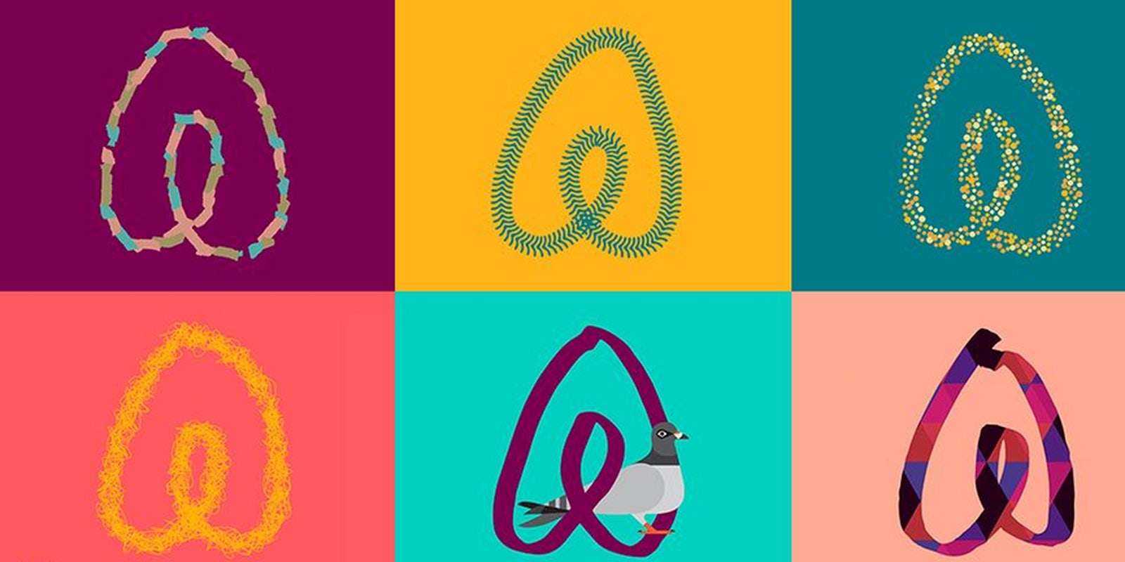
Even so, there are some G-rated gems:
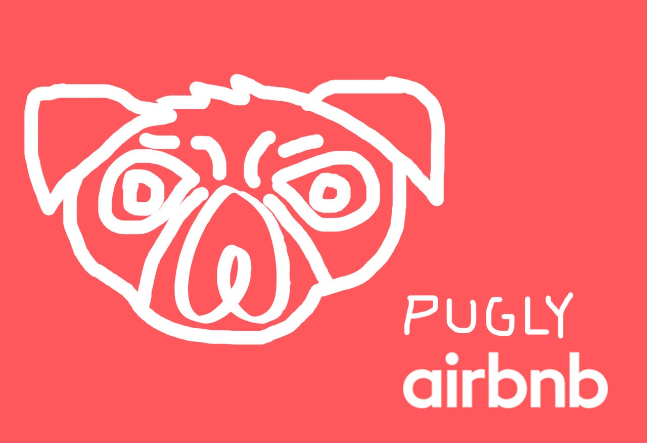
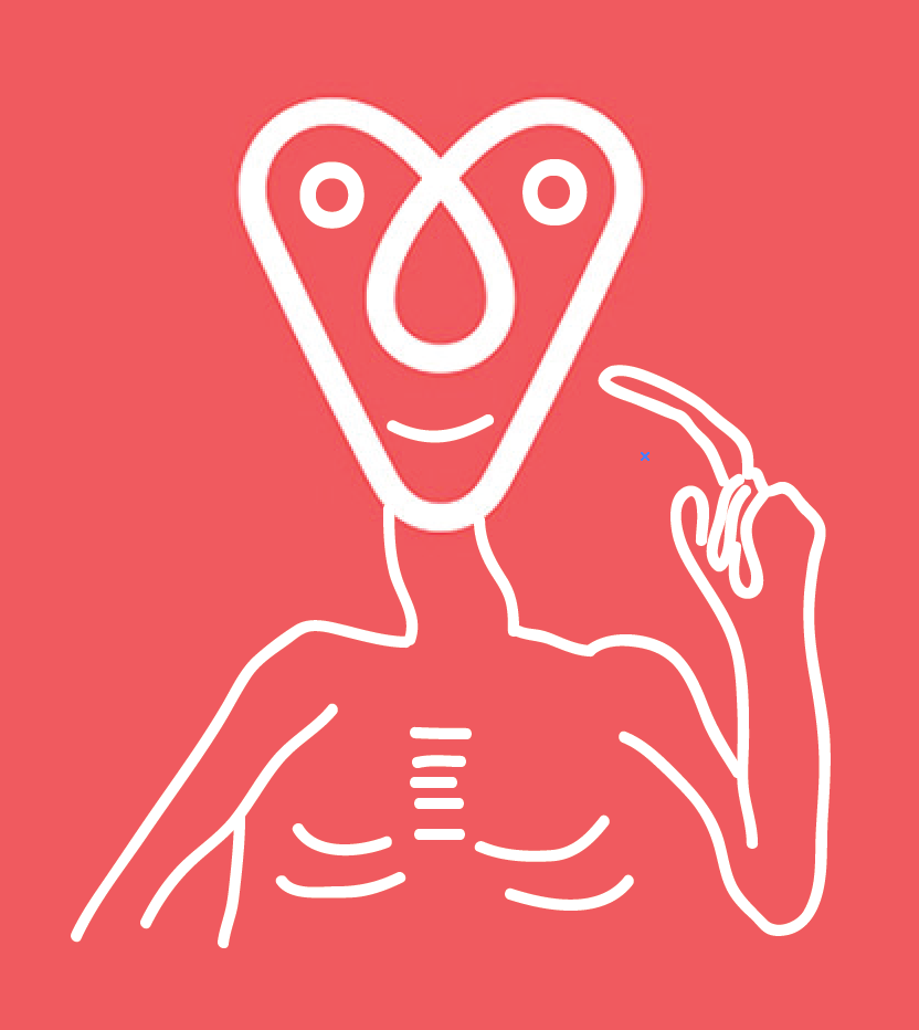
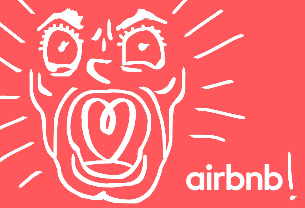
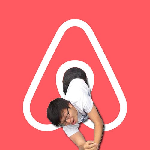
But if we had to pick one effort that most accurately conveyed the appeal of this room-sharing, hotel-disrupting, controversy-sparking business, it would obviously be this:
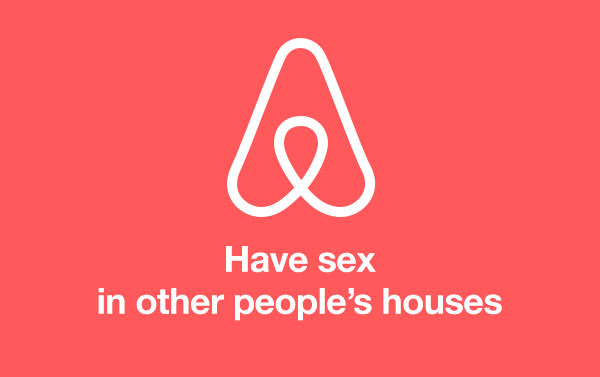
If only all branding were this honest.

