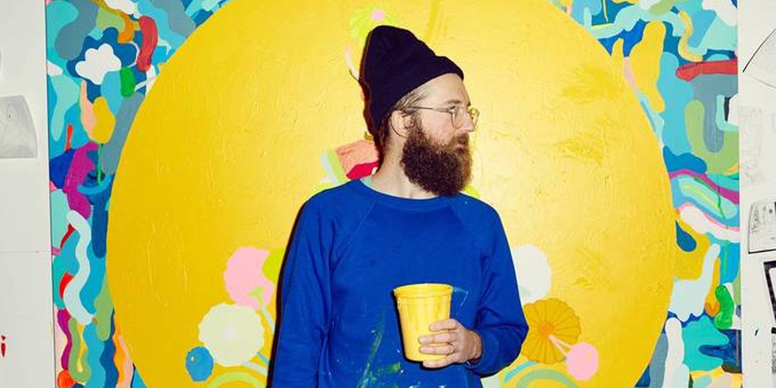
Wordplay is an art. Sometimes it takes the form of puns on Twitter or weaves its way into standup jokes. Other times, the words themselves become ecstatic visual experiences. Artist Mike Perry, who created the title animations for the hit TV show Broad City, knows about the power and playfulness that words carry.
Fittingly, Perry’s first solo show of paintings, curated by Cassandra Johnson, is called Intoxicating Pollen Wiggle in a Moist Journey of Constantly Blooming Tides, which opened on April 22 at Garis & Hahn in New York City. Like his animations for Broad City, Perry’s visual aesthetic meshes a happy-go-lucky, retro-pop sensibility with a catchiness that will catch you, but never throw you off.
“I really like words,” Perry told the Daily Dot. “I definitely have a hard time with words, and I have a little bit of dyslexia. In order to really look at words and know how they work, I have to pay attention to them, like the way the word ‘flower’ is spelled.”
Perry’s visual aesthetic and penchant for words is apparent in how he messes with the text in Broad City‘s opening credits. White letters on black pop up, then the dot on the I in “city” falls down, transforming into a yellow blob that then becomes many colors at once, and then lurks back up into the background of the title screen. Magically, the colors of the blob transform into the Broad City title text again, and colors flash and transform everything on-screen like some sort of acid trip.
Perry relates to the written word as a visual experience more than a literary one.
“I like words that are more fun to look at,” he said. “They’re like visual words.”
In celebrating words for what they are rather than trying to form them into something with a narrative, Perry lets the images playfully form themselves. It’s this sort of celebratory vibe that Perry brings to all of his creative work, whether it is commercial or fine art. The title of this solo exhibition calls to mind an earthly awakening, and is reminiscent of a surrealist automatic writing exercise.
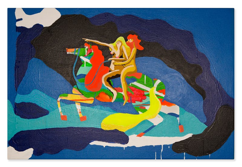
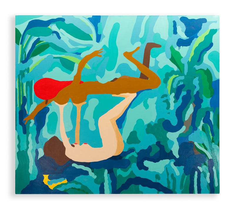
Perry plays with this same sort of sensibility in his exhibition. In “Yes Please” (2015), a smiley face with white eyes and a curved mouth laps on top of a mosaic of color and squiggles, suggesting a warped version of the red-cheeked smiley face emoji which could communicate that same sentiment. Other pieces feature more of a cartoonish playfulness, such as “Off We Go Into the Unknown Together” (2015), in which two nude people—one red-headed man and a woman with long blonde hair—ride off on an enchanted horse-like creature. In “Moring,” two ladies’ bodies are draped over one another, like an almost completed 69, and their boobs look like olives. Squiggles and free-form loops are nestled within a graffiti-esque background.
As with his Broad City illustrations, Perry starts a visual story but then decides to leave the rest to the imagination.
Perry’s journey into the creative world began when he was a child. “One of my favorite activities, which stems from childhood, is me sitting on the couch, watching TV and drawing,” he said. “This act I’ve done since I was 4.”
Growing up in Kansas City, Missouri, Perry’s parents were supportive of his choice to go into the arts. His father worked for his grandfather, and together they built houses. He was artistic, and sometimes Perry and his dad would draw together. Perry’s maternal grandfather, however, was the most artistic of all. He lived in middle-of-nowhere Springfield, Missouri, on a junkyard.
“He never really showed his work and when he passed away it was just the end of his body of work,” Perry said. “I had this realization about him, and I posted a photo of one of his paintings on Instagram in this moment. In that one moment of me posting his photo, his work was seen by more people than probably most of his life.”
Perry attended art school at the Minneapolis College of Art and Design, and then moved to New York. His work portfolio is vast, with projects ranging from books and clothing to drawings, murals, posters, products, and sculpture.
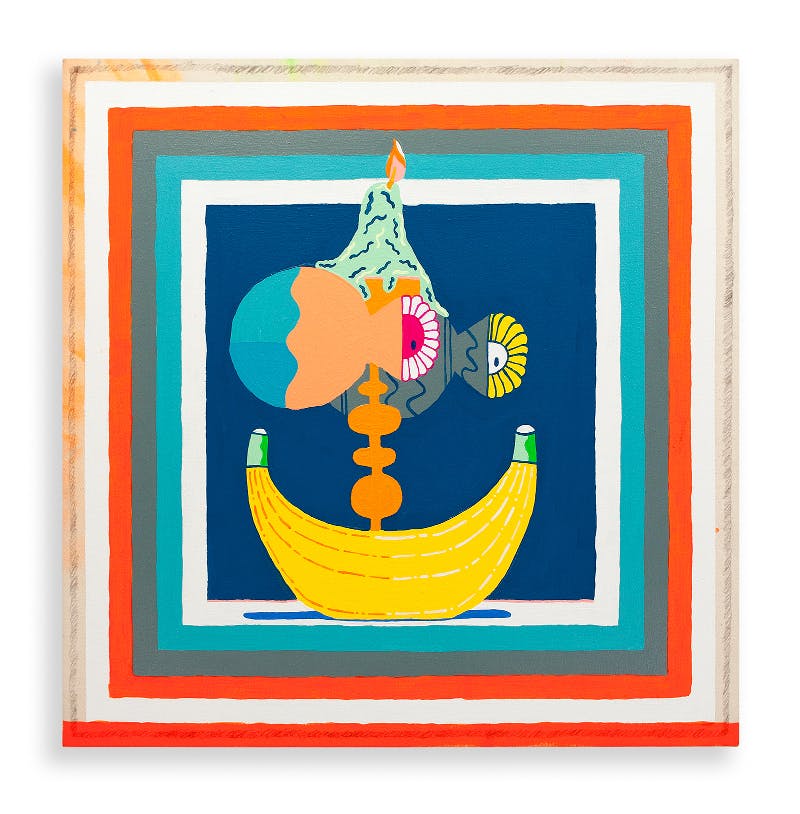
As an artist, he is influenced by his contemporaries. He refers to artist John Singer Sargent as one of his “art crushes.” He also admires peers like London-based Andrew Rae, who has done illustrations for the New York Times magazine and the New Yorker, among others. Perry is also influenced by Los Angeles-based contemporary artists such as Geoff McFettridge and Steve Harrington, both of whom have a similar, brightly lit pop aesthetic, and maintain strong commercial and fine art practices. There’s a calming yet perky and quirky sensibility to Perry’s work, which is mired in the standard forms of modernism, such as the landscape, bodies, and still-lives. Though he is very much engaged with visual culture and social media, he admits that he does “kind of like traditional things.”
He also loves television, especially shows that go deep into universes like Breaking Bad and its spinoff, Better Call Saul. Perry prefers sci-fi to sitcom, tending toward shows like Star Trek: Next Generation and X-Files rather than Seinfeld or Frasier.
His solo exhibition is like a TV show without the constant camera cuts or actors. Instead, we see people poised in perfectly still positions, enraptured by their surroundings. It’s a collection of the traditional meets loopy—bodies and landscapes teeming with color—and images that float on.


